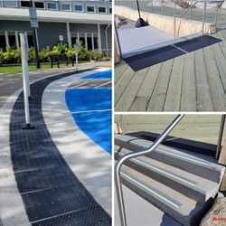
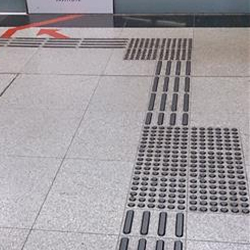
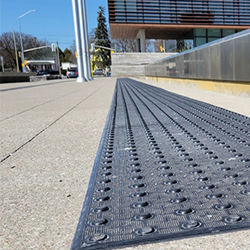
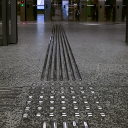
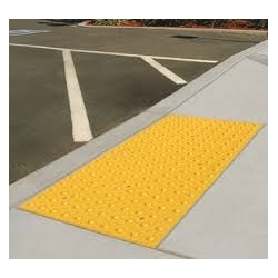
The most expensive tactile tile mistake is often made before a single tile is installed.
It happens when a contractor, building owner or project manager chooses a product first and checks the applicable accessibility requirement later.
In Canada, that order should be reversed.
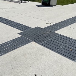
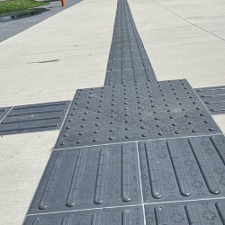
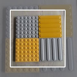
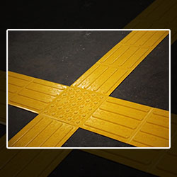
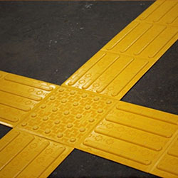
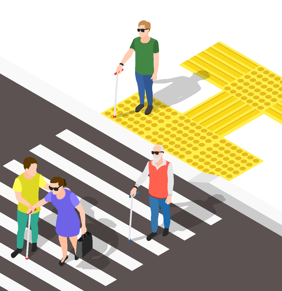
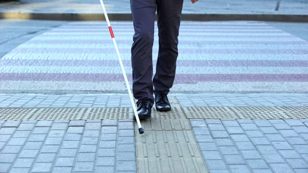
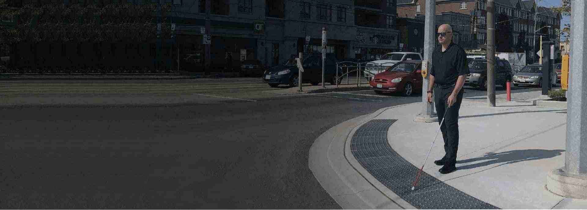
Tactile tiles, more formally called Tactile Walking Surface Indicators (TWSIs), are not decorative floor accessories. They communicate information through texture, contrast and placement to people who are blind, have low vision or use a long cane. Attention indicators warn of a hazard or transition. Direction indicators help establish an understandable route through spaces where other wayfinding cues are limited.
“A successful tactile surface communicates the right message before the pedestrian reaches the hazard.” - Shubham Banyal
For projects planned in 2026 and 2027, there is another reason to pay close attention: Canada's accessibility framework continues to evolve. The National Building Code of Canada 2025 has been published, Ontario is operating under its 2024 Building Code, and Accessibility Standards Canada has important wayfinding and built-environment standards progressing toward anticipated 2027 publication.
So, what actually applies to your project today, and what should you prepare for next?
For contractors, architects, property managers and building owners, think of tactile compliance as a six-part chain:
Getting only five of those six right can still produce a poor installation.
That is why simply purchasing a product described as an “AODA tactile tile” or “CSA tactile” is not enough. Compliance depends on the complete installed condition, not merely the material sitting in a box.
There is no single tactile requirement code in Canada. This is one of the most important distinctions for anyone specifying tactile tiles in Canada.
The National Building Code of Canada is a model code. The NRC specifically advises users to determine which codes and regulations apply in their province or territory because adoption occurs through provincial and territorial authorities. The current National Building Code of Canada 2025 is available, but its publication does not automatically make every provision enforceable in every municipality on the same date.
For a real project, your compliance review may therefore involve:
This is why a Toronto condominium entrance, federally regulated transportation facility and municipal streetscape project should not automatically use an identical specification.
CSA/ASC B651:23, Accessible design for the built environment, is an important Canadian technical accessibility standard. It addresses accessible paths, surfaces, tactile indicators and other built-environment features.
TWSIs generally fall into two functional categories:
The Tactile Solution accessibility-code guide correctly emphasizes the importance of CSA B651 for the design and placement of tactile warning and guidance systems, while industry compliance guidance also identifies CSA B651 as a major technical reference for Canadian TWSIs.
However, a useful distinction for project teams is this: a standard and an enforceable building regulation are not automatically the same thing. Determine how the relevant standard has been referenced or adopted for your particular jurisdiction and project.
Ontario gives project teams particularly useful, specific requirements.
The 2024 Ontario Building Code came into effect January 1, 2025 and adopts the National Building Code of Canada 2020 with Ontario amendments.
Article 3.8.3.18, Tactile Attention Indicators, requires a tactile attention indicator, where required, to conform to specified provisions of ISO 23599. It also establishes a depth of not less than 300 mm and not more than 610 mm in the direction of travel.
That 300–610 mm figure is particularly important because it is frequently repeated online without explaining that it comes from an Ontario code provision. It should not be presented as a universal dimension automatically governing every Canadian installation.
Examples under the current Ontario framework include several conditions that contractors frequently encounter.
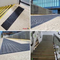
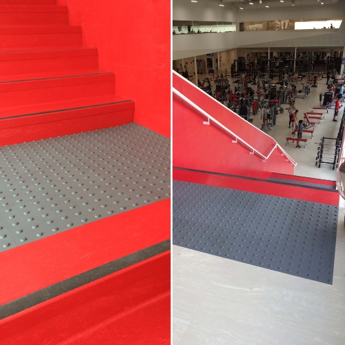
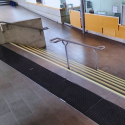
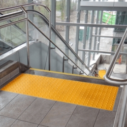
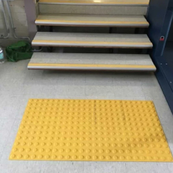
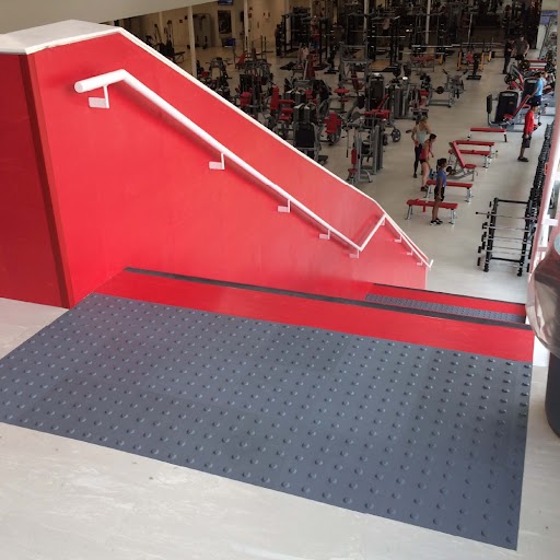
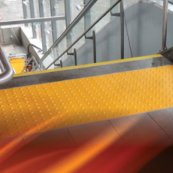
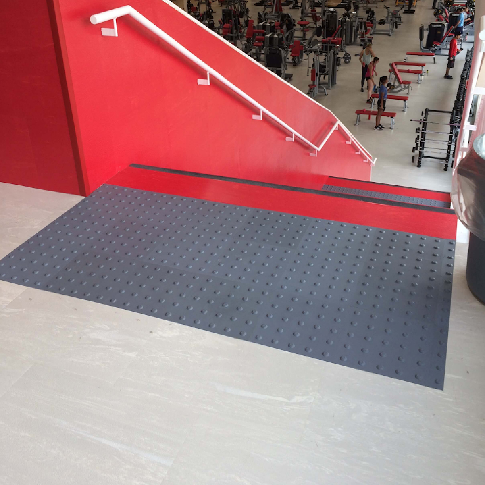
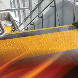
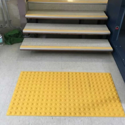
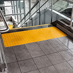
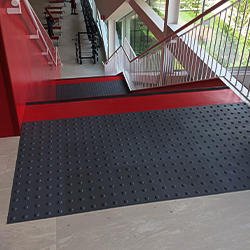
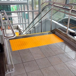
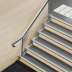
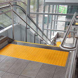
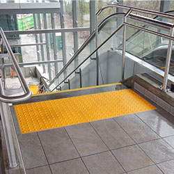
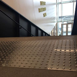
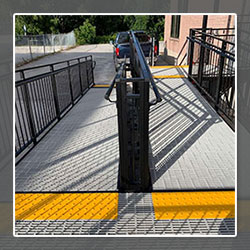
At stairs, the 2024 OBC requires a tactile attention indicator at the top of stairs, starting one tread depth back from the top stair edge, in applicable situations. Similar treatment is required at certain landings where a doorway opens onto stairs.
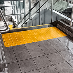
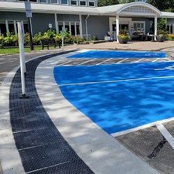
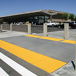
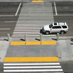
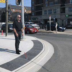
The Code also addresses tactile warning at other hazards. For example, tactile attention indicators are required at certain unenclosed stairs and unguarded drop-off edges, while accessible exterior walks require an indicator where pedestrians enter a vehicular route or area without a curb or another separating element.
For contractors, this leads to a practical rule: Do not determine tactile coverage by guessing where a warning “looks appropriate.” Determine the code-triggering condition first.
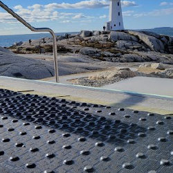
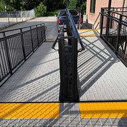
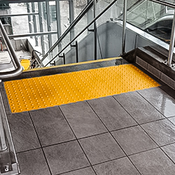
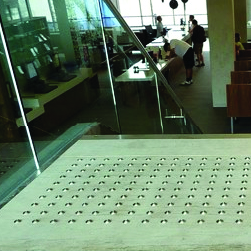
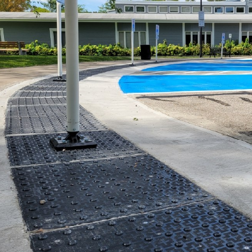
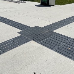
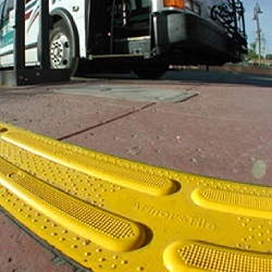
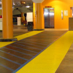
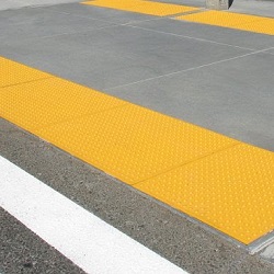
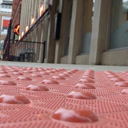
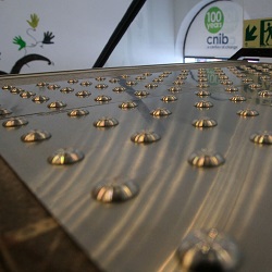
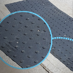
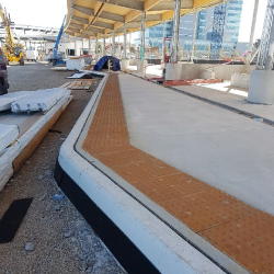
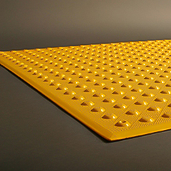
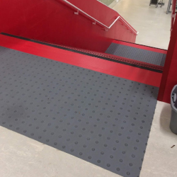
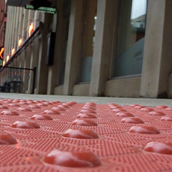
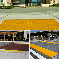
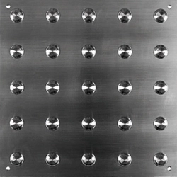
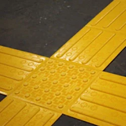
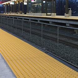
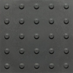
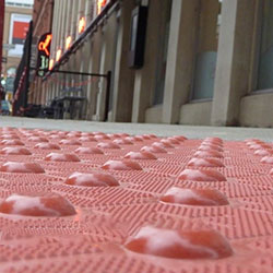
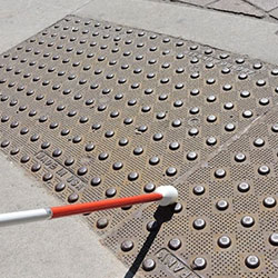
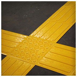
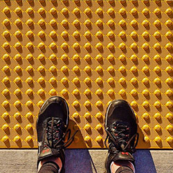
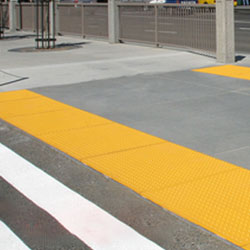
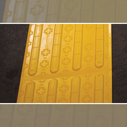
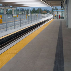
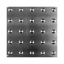
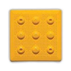
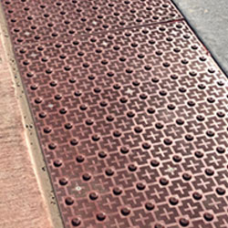
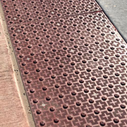
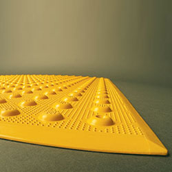
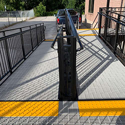
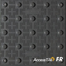
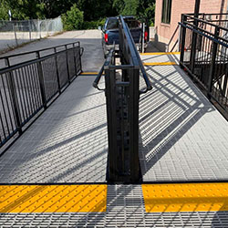
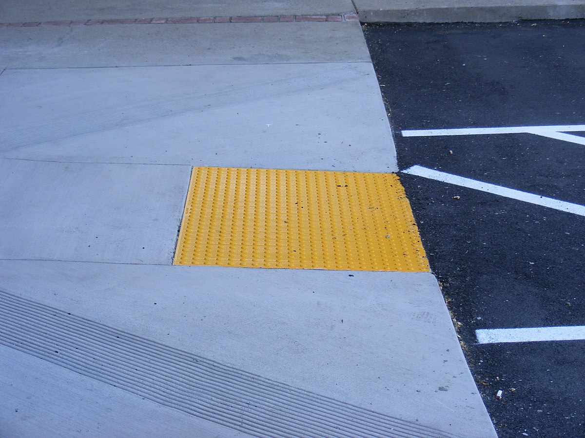
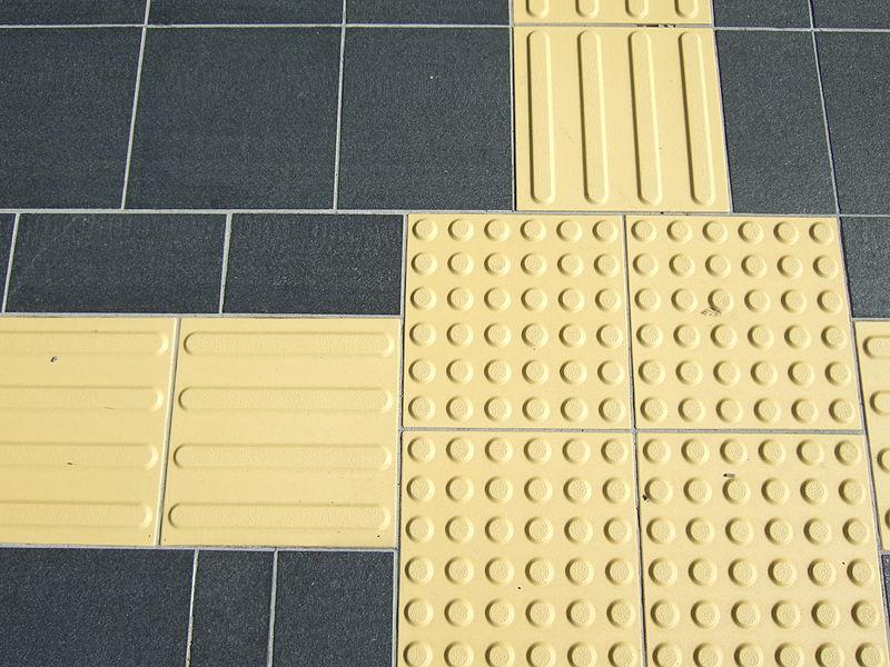
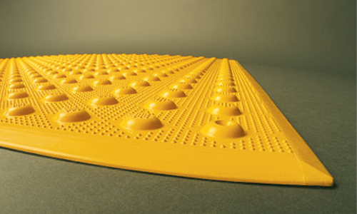
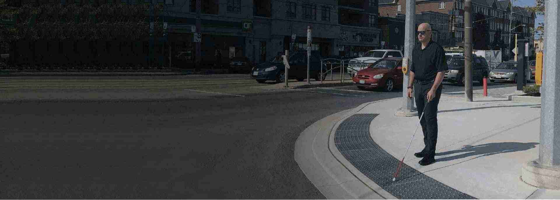
Truncated domes are attention indicators. Their purpose is to make a person stop, become alert or recognize a significant change in the environment. Depending on the applicable code and site design, this may include approaches to stairs, platform or drop-off edges, pedestrian/vehicular interfaces and similar hazards.
The raised dome profile is intended to be detectable underfoot and with a long cane while remaining compatible with pedestrian circulation.
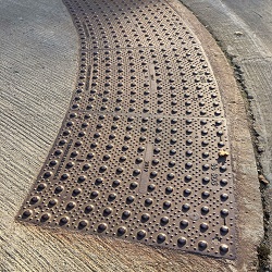
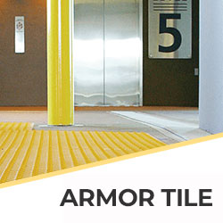
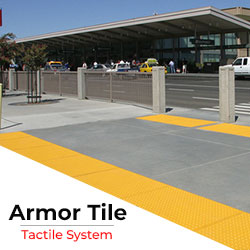
For new concrete construction, a project may benefit from durable cast-in-place systems such as Armor Tile Cast-in-Place tactile indicators or Access Tile tactile systems.
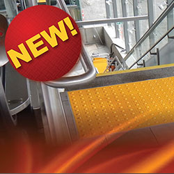
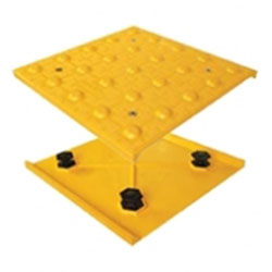
For existing cured surfaces where demolition is undesirable, Access Tile surface-applied tactile tiles provide a retrofit-oriented option.
The correct choice still depends on the substrate, environmental exposure, project specification and governing requirements.
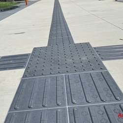
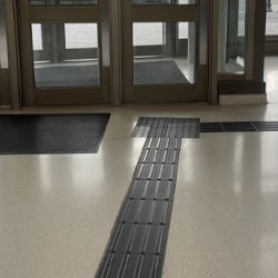
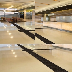
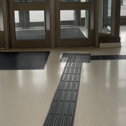
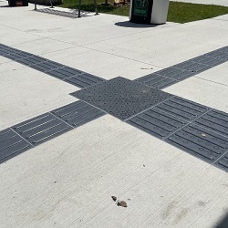
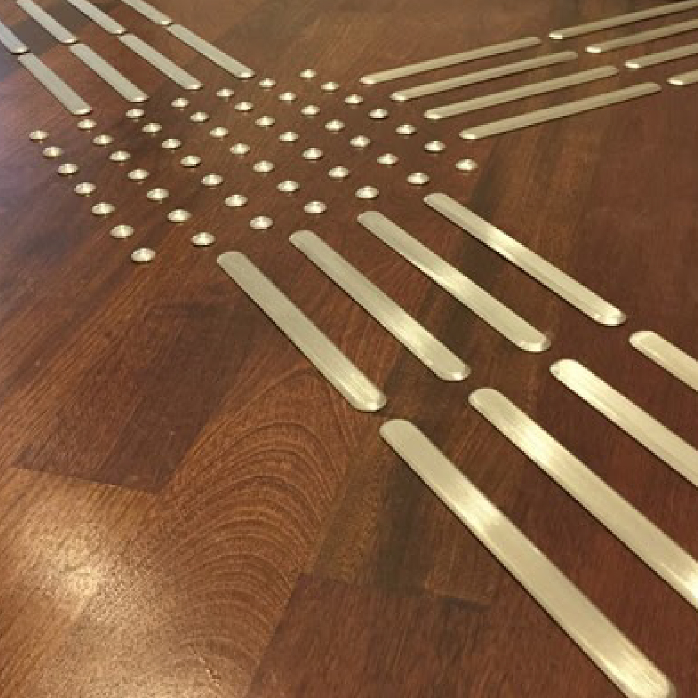
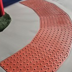
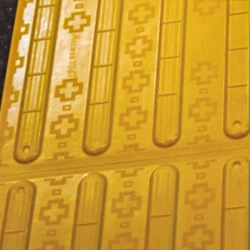
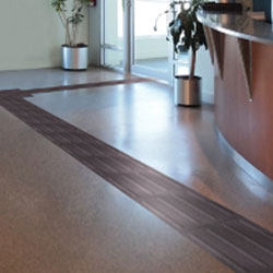
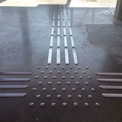
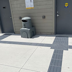
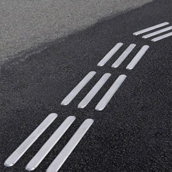
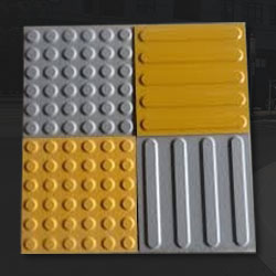
Direction indicators communicate a different message. Instead of saying “warning—pay attention,” elongated bars say “continue or orient yourself in this direction.”
They are especially useful in large spaces where walls, edges and other natural navigation cues are absent,for example:
Tactile Solution's Access Tile Surface-Applied Wayfinding Bars are designed for this type of directional application.
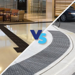
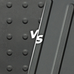
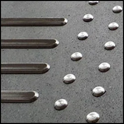
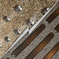
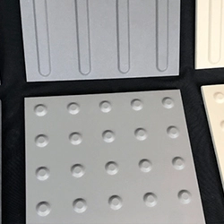
One mistake to avoid is treating domes and bars as interchangeable simply because both are tactile. They communicate different information.
Canadian accessibility references commonly use a tactile element height in the 4–5 mm range. For example, the current draft federal Model Standard for the Built Environment specifies truncated domes between 4 mm and 5 mm high, with a base diameter of 23–36 mm and defined spacing requirements.
The industry compliance reference supplied for this article similarly identifies the 4–5 mm range in its discussion of CSA B651.
For an actual tender or permit submission, however, dimensional verification should always be made against the edition of the standard expressly referenced by the applicable code or specification.
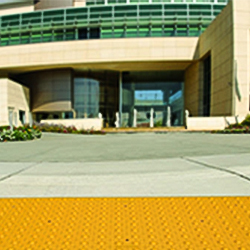
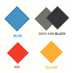
Very much, but contrast matters more than simply choosing a familiar colour. Bright yellow is common for attention surfaces because it often creates strong visual differentiation, but “yellow” by itself does not prove that an installation has adequate luminance contrast against its surrounding flooring.
The emerging federal Wayfinding and Signage standard illustrates where Canadian design guidance is heading: its draft provisions measure contrast objectively and distinguish requirements according to the visual task. It also proposes specific contrast treatment for attention and direction indicators.
That matters for specifications involving:
A colour that contrasts beautifully with one floor may disappear visually against another.
As of now, CAN-ASC-2.4 – Wayfinding and Signage remains a draft, with publication expected in summer 2027. Its draft TWSI provisions distinguish attention indicators from direction indicators, address placement, geometry, contrast and tactile pathways in open environments.
Similarly, CAN-ASC-2.3 – Model Standard for the Built Environment is still identified by Accessibility Standards Canada as a draft, with anticipated publication in fall 2027. Accessibility Standards Canada states that its standards are voluntary standards for federally regulated entities and may be recommended to the responsible minister.
Therefore, project teams should use these documents intelligently: Do not label draft 2027 provisions as current law. But do watch them when designing projects expected to remain in service for decades.
Transport Canada's plan is not a tactile-tile construction code, but it provides useful context about where federal accessibility priorities are moving.
The department identifies the built environment as one of its accessibility pillars and discusses measures such as tactile/raised signage. Its consultation findings also identify physical-environment barriers involving signage, entrances, elevators and simply moving through facilities.
That is important because it demonstrates a broader shift: accessibility is increasingly being considered as an end-to-end navigation experience, rather than a collection of isolated products.
The Accessible Canada Act reinforces that direction with its objective of realizing a barrier-free Canada by January 1, 2040 in areas under federal jurisdiction, including the built environment and transportation.
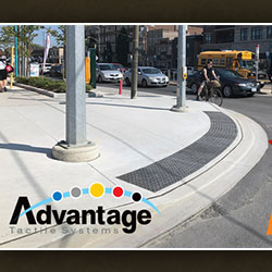
For new concrete sidewalks, curb areas or exterior construction, cast-in-place systems can provide secure integration with the substrate. Durable polymer systems such as Armor Tile are one option, while Advantage Cast Iron tactile plates can suit projects where robust metallic construction and long service life are priorities.
For existing concrete, surface-applied systems can reduce the need for major demolition and are particularly useful in accessibility retrofits.
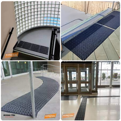
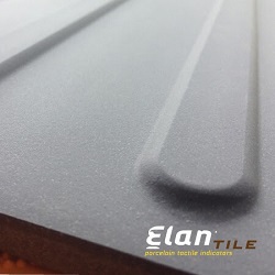
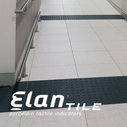
For high-finish architectural interiors, discrete stainless-steel indicators or porcelain products may better integrate with the design language of the building. Elan Porcelain tactile indicators offer both warning and directional configurations, while Advantage individual stainless-steel domes and bars provide another approach to interior applications.
For institutional and commercial interiors requiring resilient tactile surfaces, EON tactile tiles include both attention and directional patterns.
Product selection should account for more than appearance. Review:
That is where a product-selection tool becomes more useful than a generic catalogue. Tactile Solution's Tactile Product Match tool lets project teams narrow options by application, indoor/outdoor location, substrate, installation type and tactile function.
A well-designed accessible route should communicate consistently.
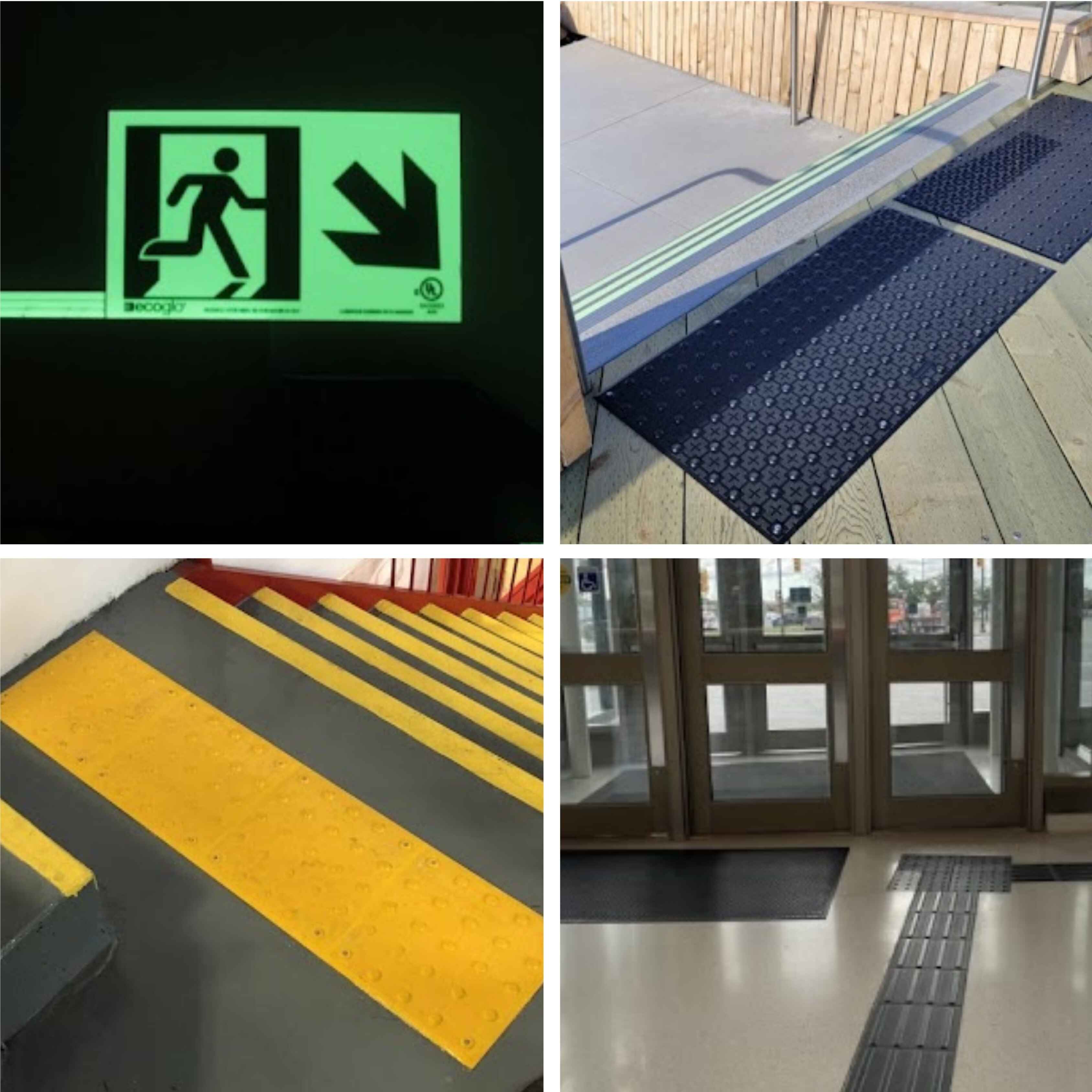
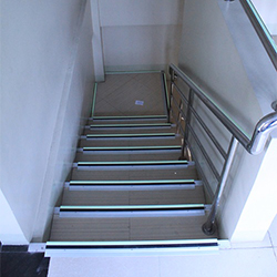
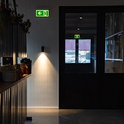
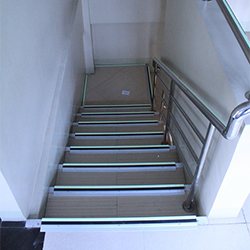
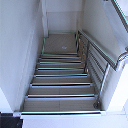
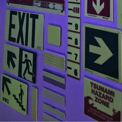
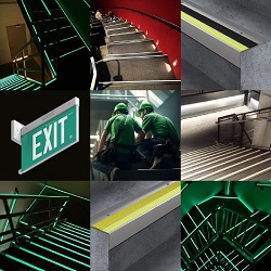
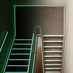
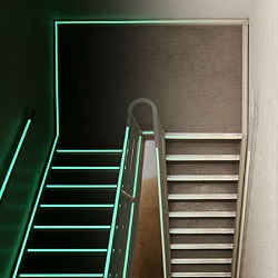
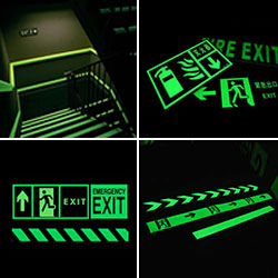
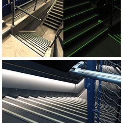
A person approaching a stair may need more than a tactile warning at the landing. The stair edge itself must remain clearly perceptible, emergency direction needs to remain understandable, and the route should continue to make sense in reduced lighting.
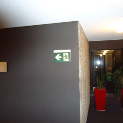
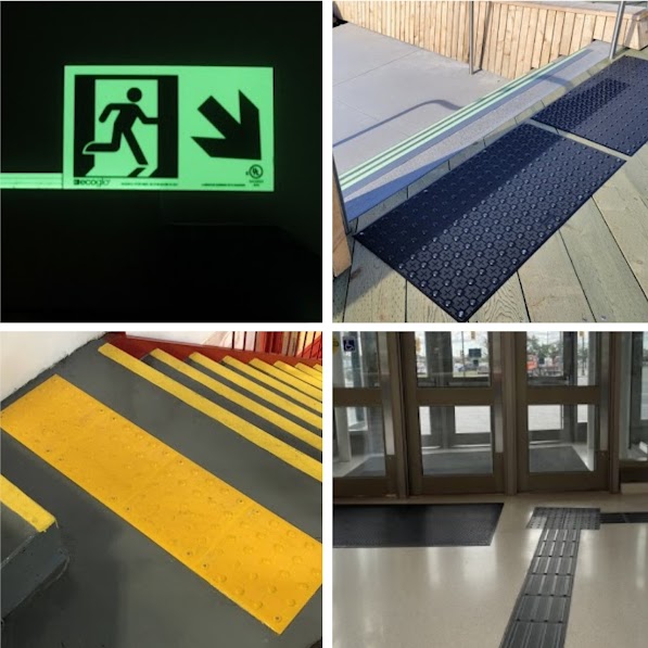
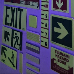
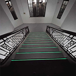
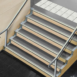
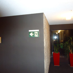
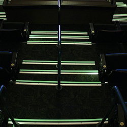
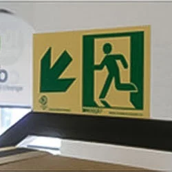
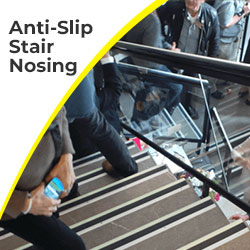
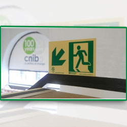
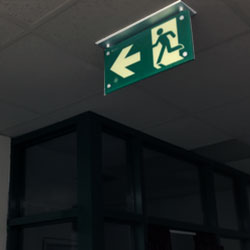
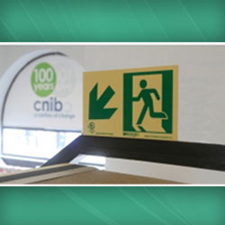
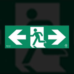
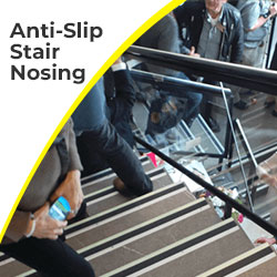
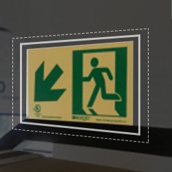
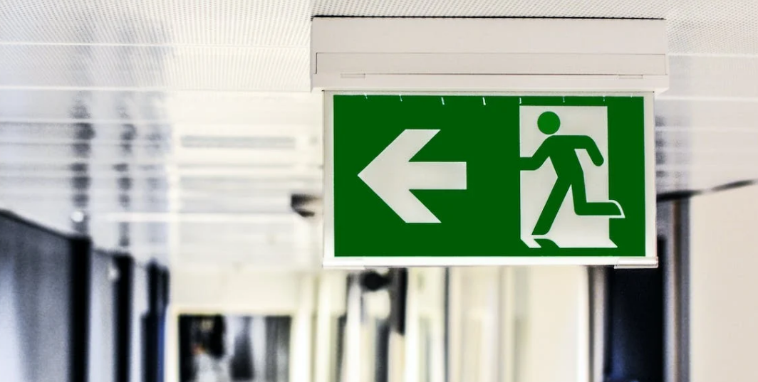
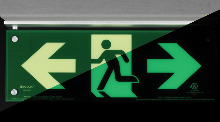
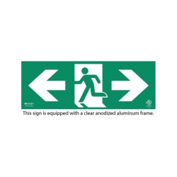
Where the project requires it, complementary systems may therefore include high-visibility or photoluminescent stair-edge treatments such as Ecoglo photoluminescent stair nosings and properly specified exit or directional signage.
This does not mean adding every accessibility product everywhere.
It means avoiding the “single-product compliance” mindset.
Accessibility works as a connected system.
In 2026–27, choosing tactile tiles is no longer just a question of “Which yellow pad should we install?”
The better questions are: What information must this surface communicate? Which requirement governs this site? Can a person detect it reliably? Will its contrast remain clear? And will it still perform after years of Canadian weather, traffic and maintenance?
Those questions lead to better specifications and, ultimately, better buildings.
For new construction, retrofits, transit environments, condominiums, commercial spaces or public facilities, start with the requirement and then choose the material, not the other way around.
Tactile Solution Canada supplies attention domes, directional wayfinding bars, cast-in-place and surface-applied systems, individual tactile indicators and complementary stair and egress products for Canadian projects. Rather than forcing one product into every application, use the Tactile Solution Finder to compare options based on the actual site condition.
Because when tactile accessibility is specified correctly, the result is more than a code item checked off a drawing.
It is a route that makes sense before someone has to ask for help. Contact us now.
The technical term commonly used in Canadian accessibility standards is Tactile Walking Surface Indicators (TWSIs). They include tactile attention indicators, normally formed with truncated domes, and tactile direction indicators, normally formed with elongated bars.
Requirements depend on the governing code and building condition. Under Ontario's current Building Code, tactile attention indicators are required at the top of stairs in specified situations and are set back one tread depth from the top stair edge. Always verify the provision applicable to the particular stair and occupancy.
Ontario Building Code Article 3.8.3.18 specifies a tactile attention indicator depth of 300 mm minimum to 610 mm maximum where that article applies.
It is more accurate to separate AODA accessibility obligations from detailed building-code specifications. In Ontario, construction details for tactile attention indicators are found in the Ontario Building Code and its referenced standards, rather than treating “AODA” as a standalone tactile-tile dimensional specification.
Yes. Surface-applied tactile tiles are specifically intended for many retrofit applications on cured surfaces. The substrate condition, adhesive or fastening system, placement and applicable code requirements still need to be verified.
No. Direction indicators are most valuable where people lack reliable natural or constructed orientation cues, especially in large open areas. Emerging Canadian wayfinding guidance also cautions against unnecessary overuse because too many tactile routes can become confusing.