In an accessible design, color contrast plays a vital role in enhancing detectability, especially for those with visual impairments. Tactile walking surface indicators (TWSIs) rely heavily on high color contrast to make their textures visually discernible. This allows partially sighted individuals to supplement the tactile cues with visual information.
For architects, contractors, and engineers specifying tactile surfaces, understanding effective color contrast principles is key to creating accessible and compliant installations. This guide will explore the significance of color contrast, guidelines from Canadian standards, and factors to consider when selecting colors for tactile tiles and surfaces.
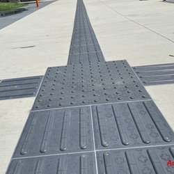
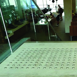
While tactilely discernible textures form the foundation of accessible design, sufficient color contrast takes detectability to the next level. Color contrast makes tactile surfaces more visible to those with partial sight, allowing them to spot upcoming changes in the walking surface and respond appropriately.
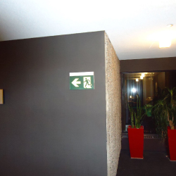
The high color contrast draws people's attention to the tactile surface, whether it is a warning indicator or a directional path. This prompts individuals to be more observant of their surroundings when they detect the shift in visual appearance between the tiles and adjacent surfaces.
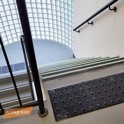
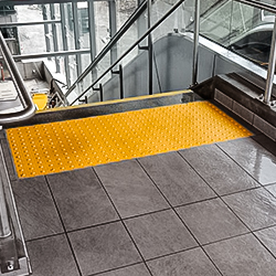
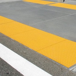
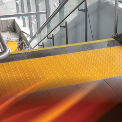
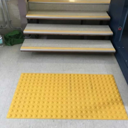
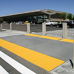
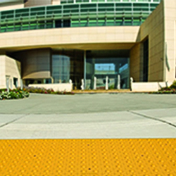
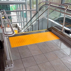
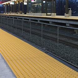
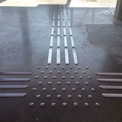
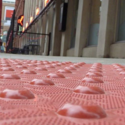
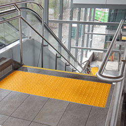
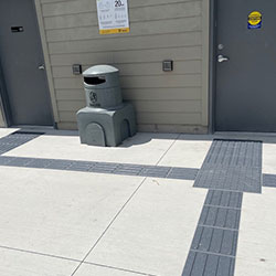
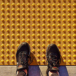
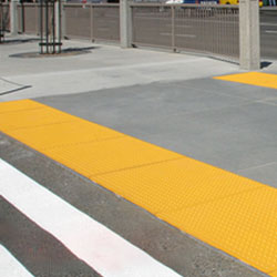
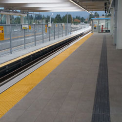
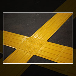
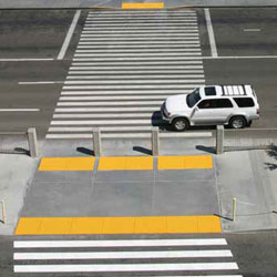
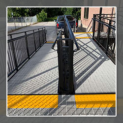
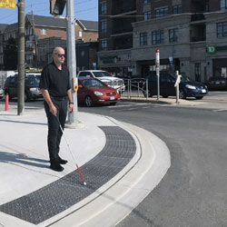
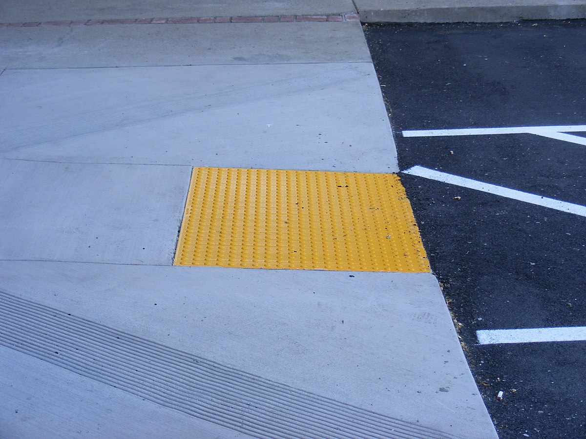
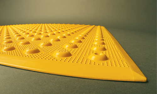
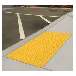
For example, bright yellow truncated domes on a sidewalk curve ramp strongly contrast with the grey concrete pavement. This alerts a pedestrian with low vision to assess their surroundings and identify the upcoming transition from sidewalk to street.
By making textures “pop” visually, strong color contrast enhances safety in public realm navigation for all individuals, especially those who rely on multiple senses beyond just touch.
In Canada, recognized standards guide appropriate color contrast for tactile walking surface indicators. These include:
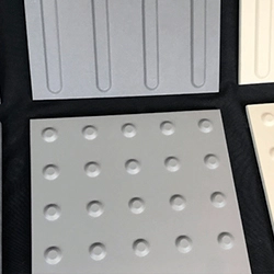
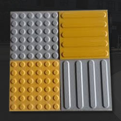
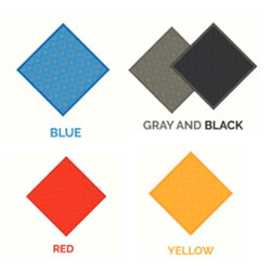
Additionally, certain colors are designated for specific tactile surface types by convention and best practice, including:
When choosing colors for a tactile installation, consider the following:
Pick colors with at least 70% light reflectance value contrast per accessibility standards. Lighter colors against darker substrates provide the most substantial contrast.
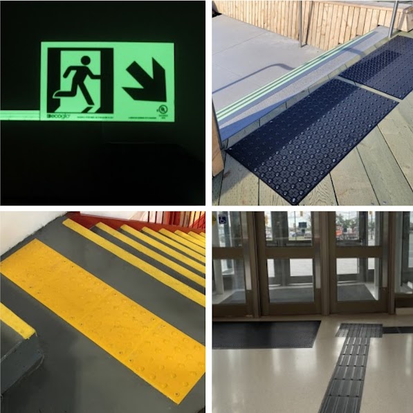
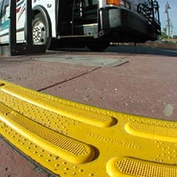
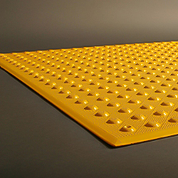
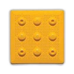
Stick to standardized colors - like safety yellow for warning domes - that align with universal design conventions.
Select colors providing sufficient contrast in daytime and night lighting for maximum discernibility. Light-on-dark often performs better in low light.
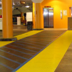
Aim for hues contrasting with adjacent material finishes like concrete, stone, metal, carpet, etc., to make the tactile surface clearly distinguishable.
Colors should stand out but complement the overall visual cohesion design scheme. Neutrals like grey and beige are easily paired.
In outdoor settings, increased contrast is key for visibility under varied conditions. Indoors, softer contrasts may suffice, depending on context.
Higher contrast is beneficial for smaller installations, whereas larger contiguous tactile surfaces already stand out, requiring less contrast.
8. Standard Availability
Select from colors that are readily available from manufacturers to avoid custom color minimums and long lead times.
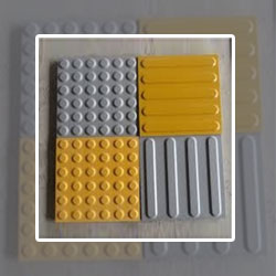
Here are some examples of tactile solutions using color contrasts that enhance accessibility:
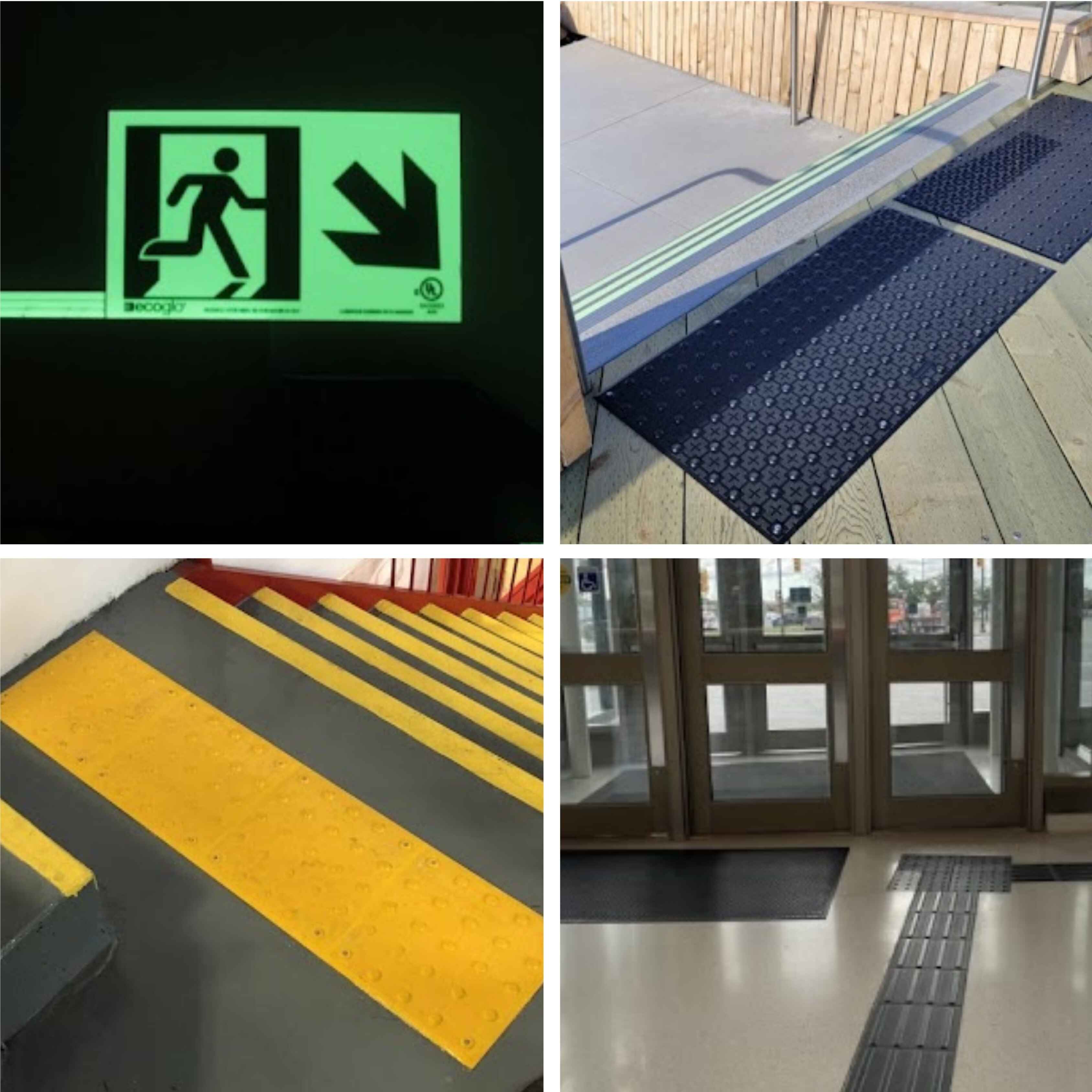
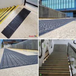
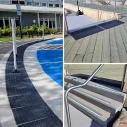
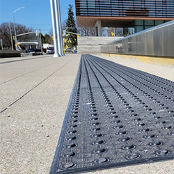
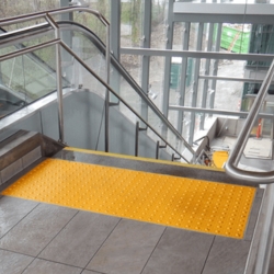
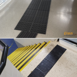
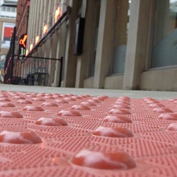
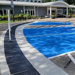
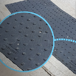
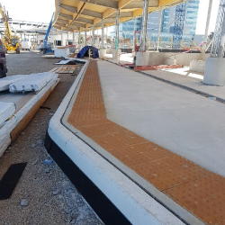
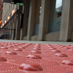
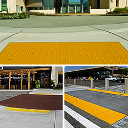
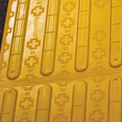
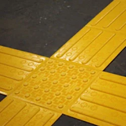
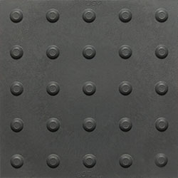
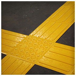
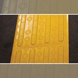
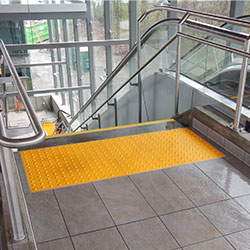
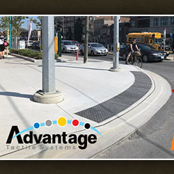
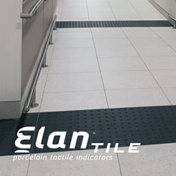
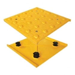
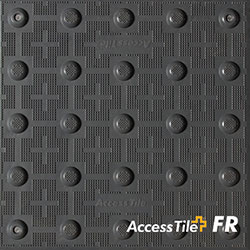
These heavy-duty metal tiles come in a bold matte yellow that strikingly contrasts against concrete sidewalks, cinder block walls, asphalt roads, and other common exterior materials. The strong dark-on-light contrast ensures high visibility outdoors.
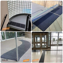
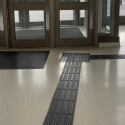
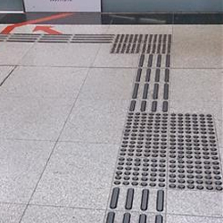
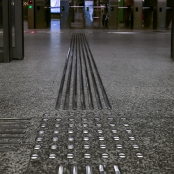
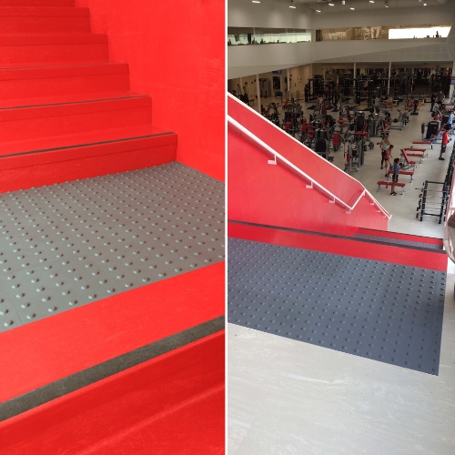
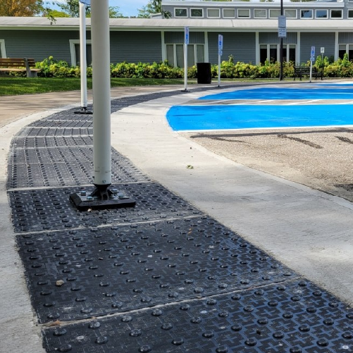
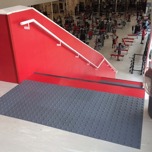
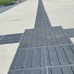
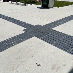
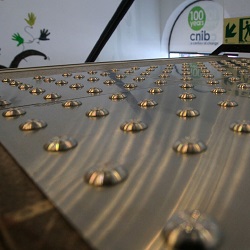
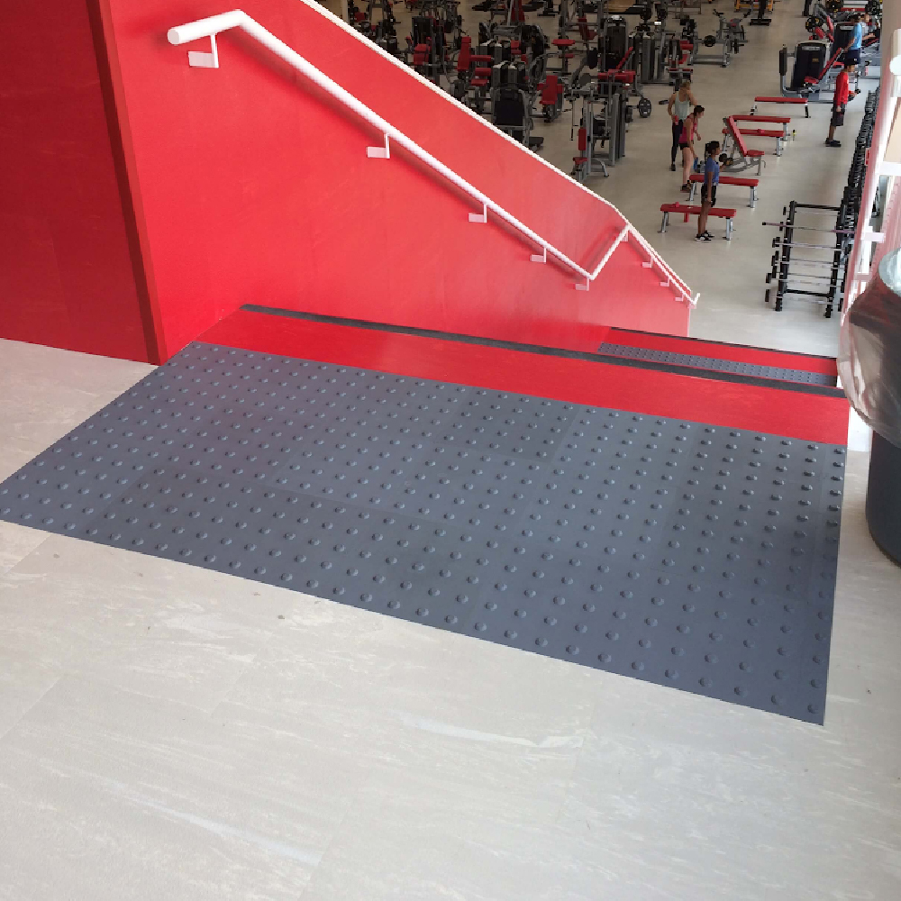
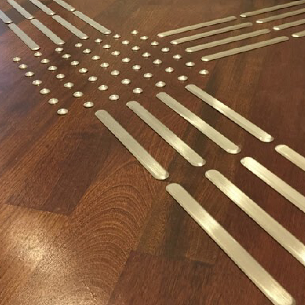
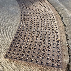
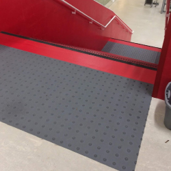
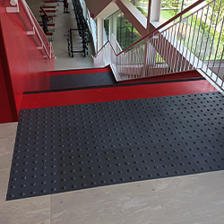
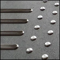
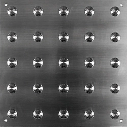
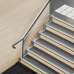
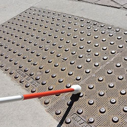
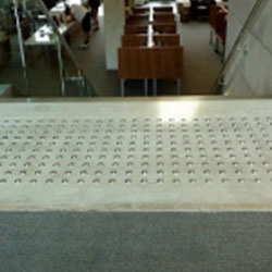
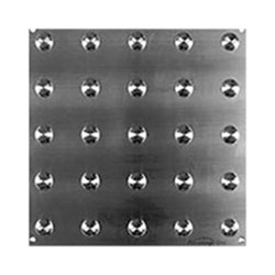
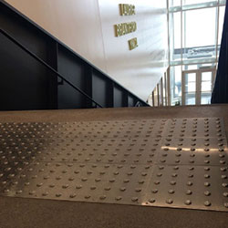
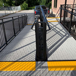
This stainless-steel plate with embedded truncated domes has a stamped textured finish that makes it pop against floor surfaces. The grey metallic color contrasts nicely both indoors and out against materials like tile, terrazzo, concrete, granite, wood, etc.
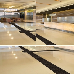
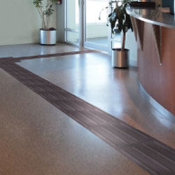
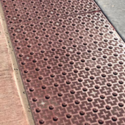
For upscale interior installations, these porcelain pavers are available in softer earth tones like cultured grey, vogue black, and sandstone that sufficiently contrast with stone, wood, or neutral floor tiles. The organic hues blend in aesthetically while remaining discernible.
Many tactile products can be custom color-matched or manufactured using specific polymers or resins on request to achieve the required color contrast against planned surfaces. Consulting manufacturers or suppliers is advised to develop optimal color-contrasted solutions for unique projects.
Standards like CSA B651 also recommend installing a test placement area to check if the specified color contrast meets minimum light reflectance value requirements through on-site verification before full-scale installation.
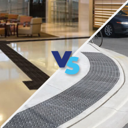
While maximizing contrast for accessibility, aesthetics and design harmony should not be sacrificed. This balances visibility needs with aesthetic vision. By thoughtfully incorporating contrast and color, tactile surfaces can enhance function without compromising form. The right colors elevate safety intuitively.
As Canada’s premier accessibility solutions provider, Tactile Solution Canada offers a complete selection of tactile walking surface indicators from leading brands designed to meet all major codes and standards in Canada.
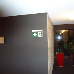
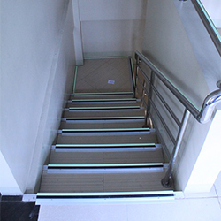
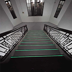
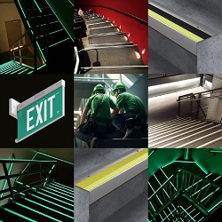
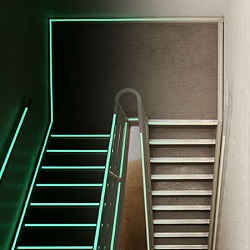
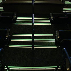
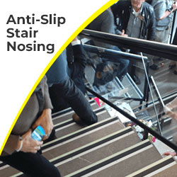
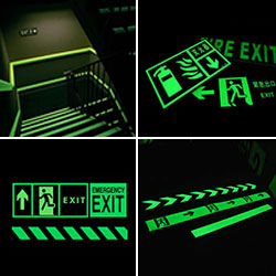
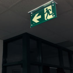
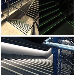
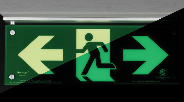
Our extensive range includes detectable warning surfaces, directional guidance tiles, and photoluminescent stair nosings in high-contrast colors created in consultation with accessibility experts.
With a client-focused approach, our team provides guidance at every stage - from initial color selection to onsite quality checks - to deliver compliant tactile installations that are impactful, functional, and harmonious.
To learn more about engineering optimal color contrast for your next project or to view our range of accessible tactile solutions, contact the experts at Tactile Solution Canada today!
A light reflectance value (LRV) contrast of at least 70% is recommended per Canadian accessibility standards like the CSA B651.
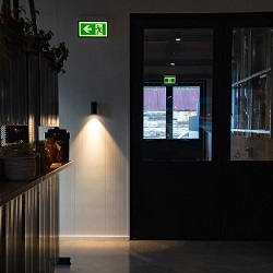
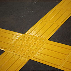
High color contrast enhances the visibility of tactile textures for those with partial sight, allowing for warning indications to be both felt underfoot and seen.
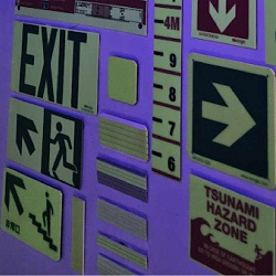
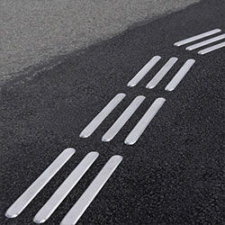
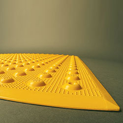
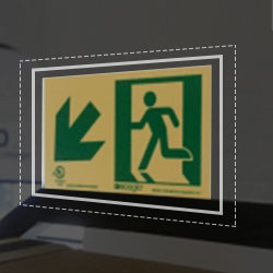
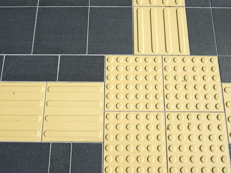
Standard colors are safety yellow for warning domes or tiles and brick red, yellow, or black for directional bars or indicators.
Yes, colors should conform to universal conventions. For example, yellow domes indicate hazards everywhere. Consistency aids recognition.
Conducting test placements and using a color contrast analyzer tool will validate if the contrast meets reflectance value requirements.