Tactile solutions are nothing less than a boon for people with vision loss. These promise accessibility and create accessible environments for people with vision loss. Simultaneously, understanding the proper use of tactile is extremely crucial.
Over 3% of Canadians aged 15 years and older, approximately 750,000 people, have disabilities that limit their daily activities. As per the 2012 Canadian Survey on Disability (CSD), 5.8% of the people under this age group are legally blind.
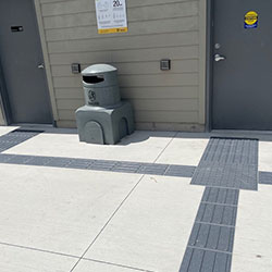
Considering such several visually challenged populations, it becomes extremely crucial to implement code-compliant tactile solutions for accessibility in public spaces.
This guide aims to cover the nitty-gritty of the setting tactile solutions and how these create accessible space for people with vision loss.
Designing a tactile solution holds the utmost importance. The designers must consider four basic elements while designing an accessible environment for people with vision loss. Let’s discuss each.
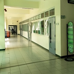
It is extremely important to logically design public spaces such as street networks, transit facilities, stores, and shopping areas. Why? Doing so helps visually challenged people memorize the space and get familiar with it quickly and easily. Use a consistent, logical, and easy layout for the exterior and interior of any planned setting.
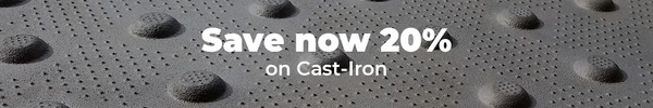
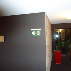
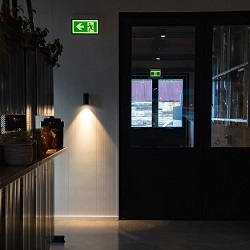
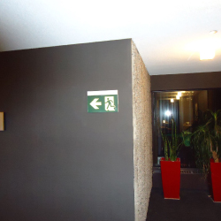
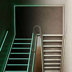
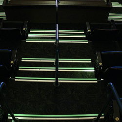
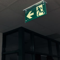
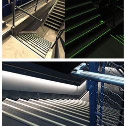
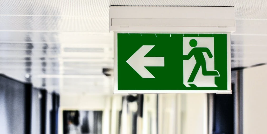
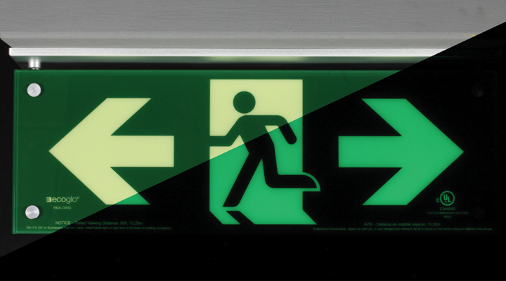
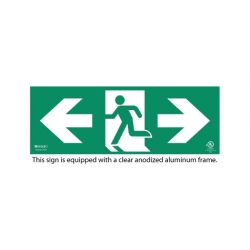
Lighting is one of the essential guiding factors for visually challenged people. Lighting kinds, styles, and locations are determined for employing lighting to aid in wayfinding and orientation.
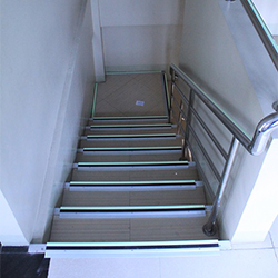
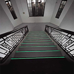
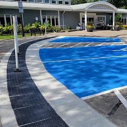
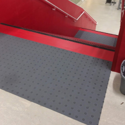
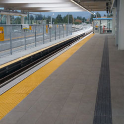
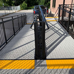
The concept of colour and brightness contrast is vital in making environments safer and more usable for everyone, greatly impacting many elements within a constructed environment. Colour contrast should be employed between travel pathways and neighbouring ground surfaces.
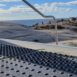
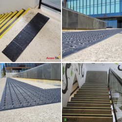
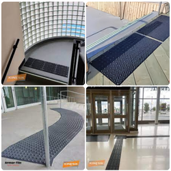
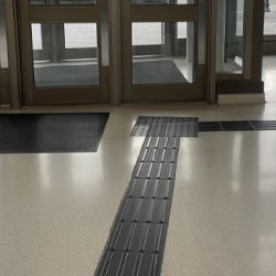
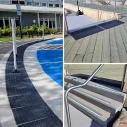
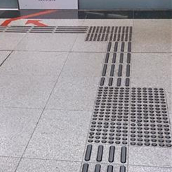
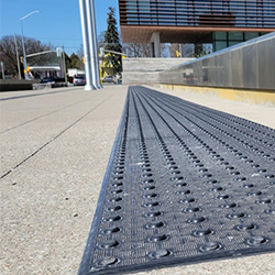
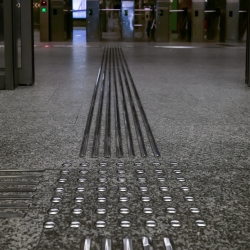
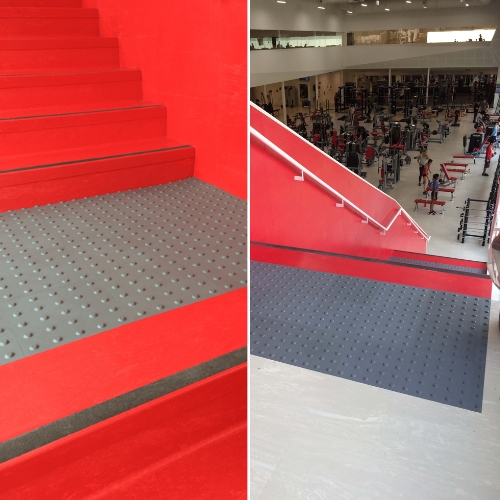
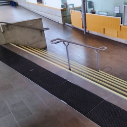
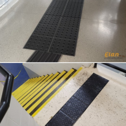
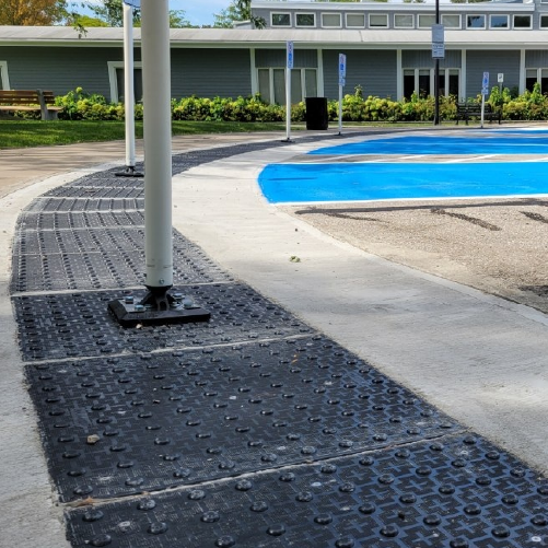
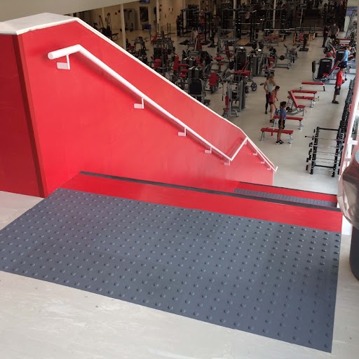
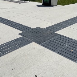
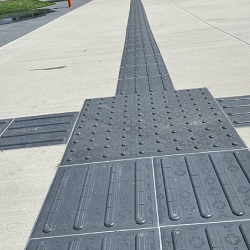
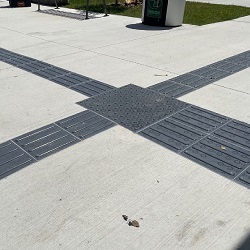
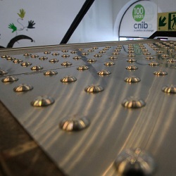
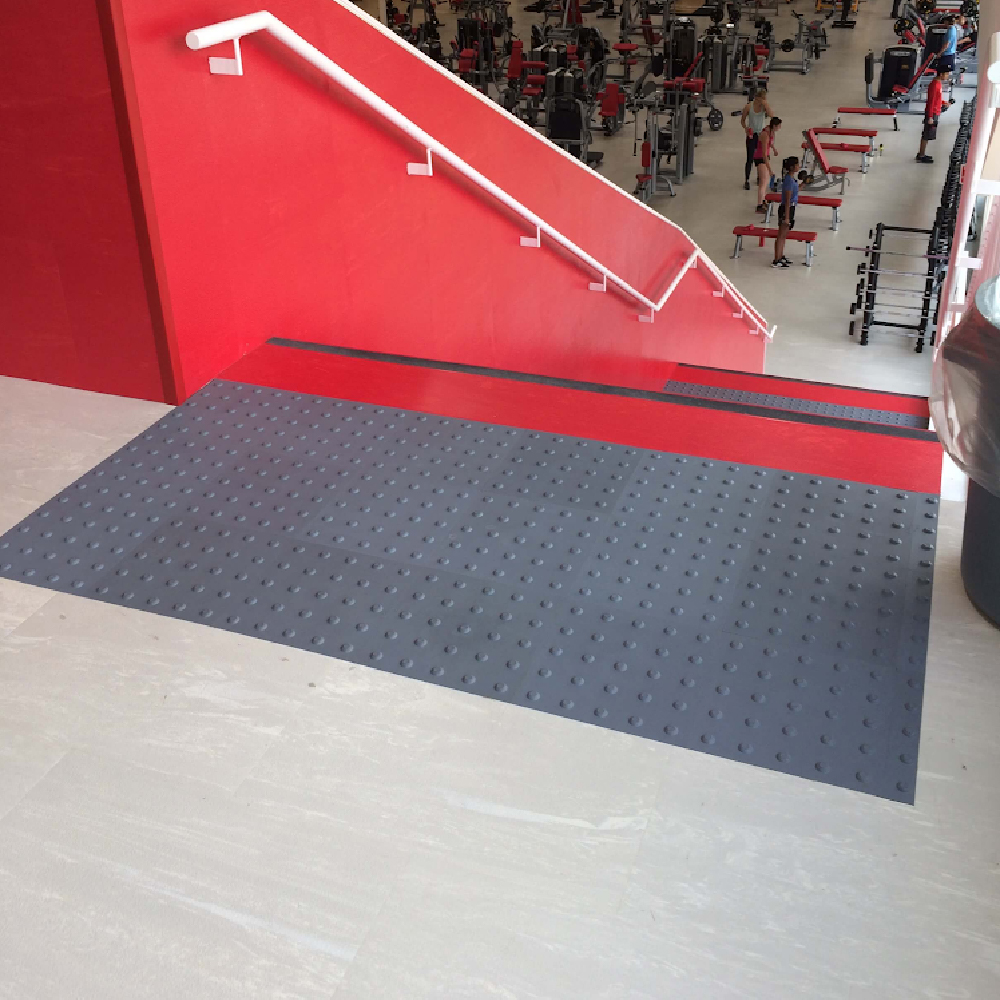
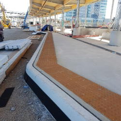
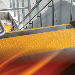
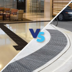
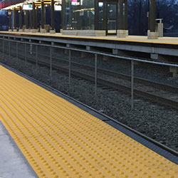
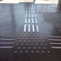
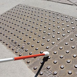
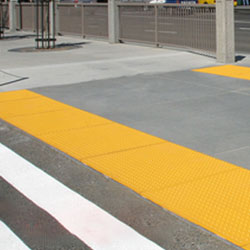
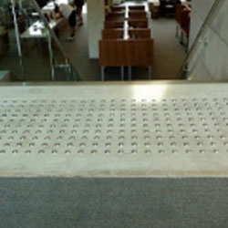
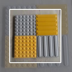
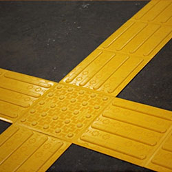
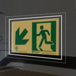
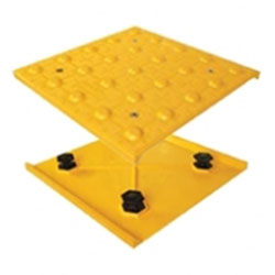
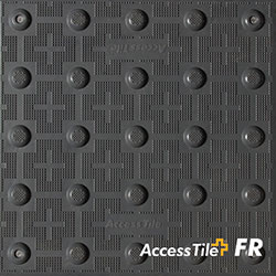
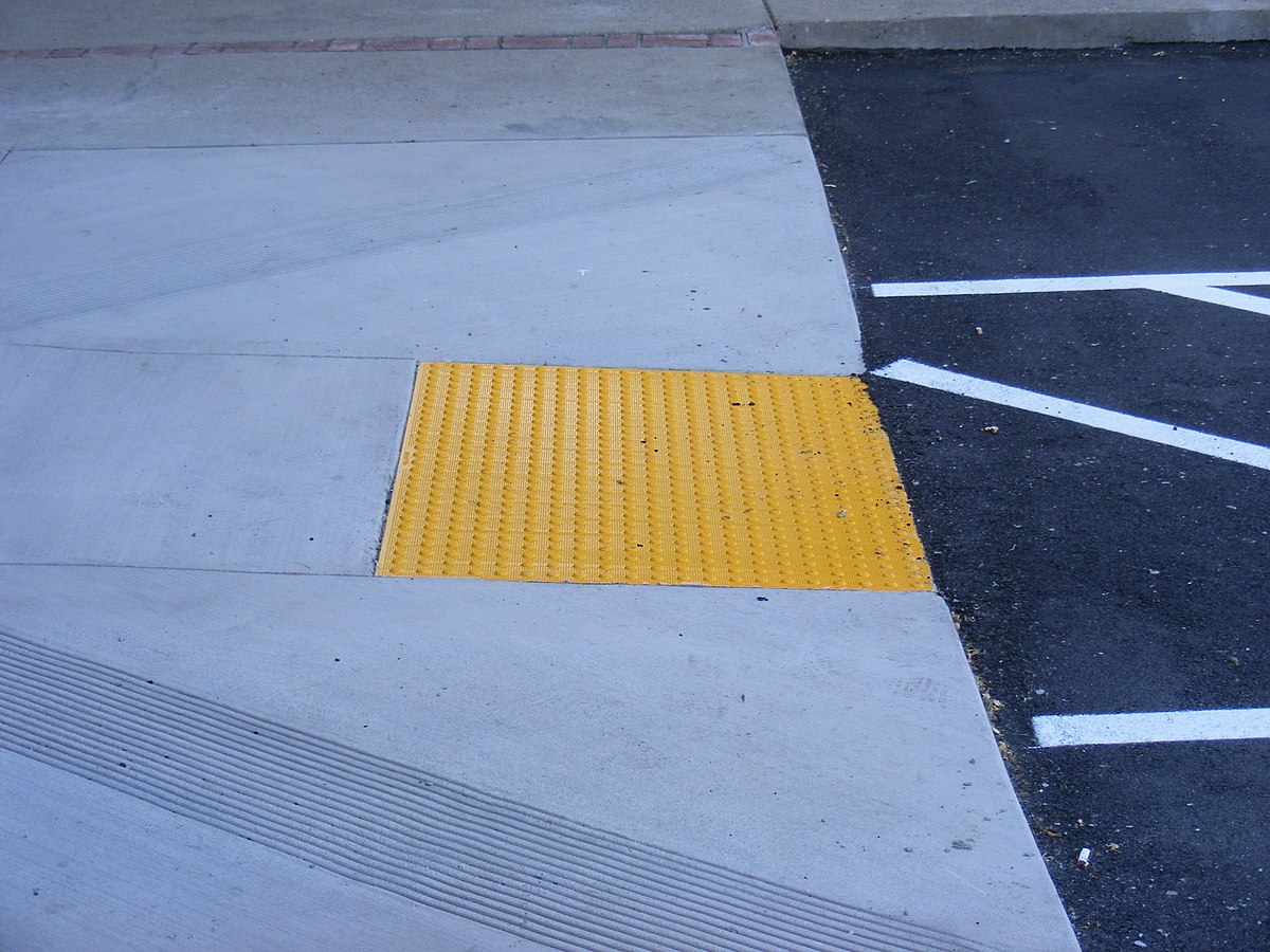
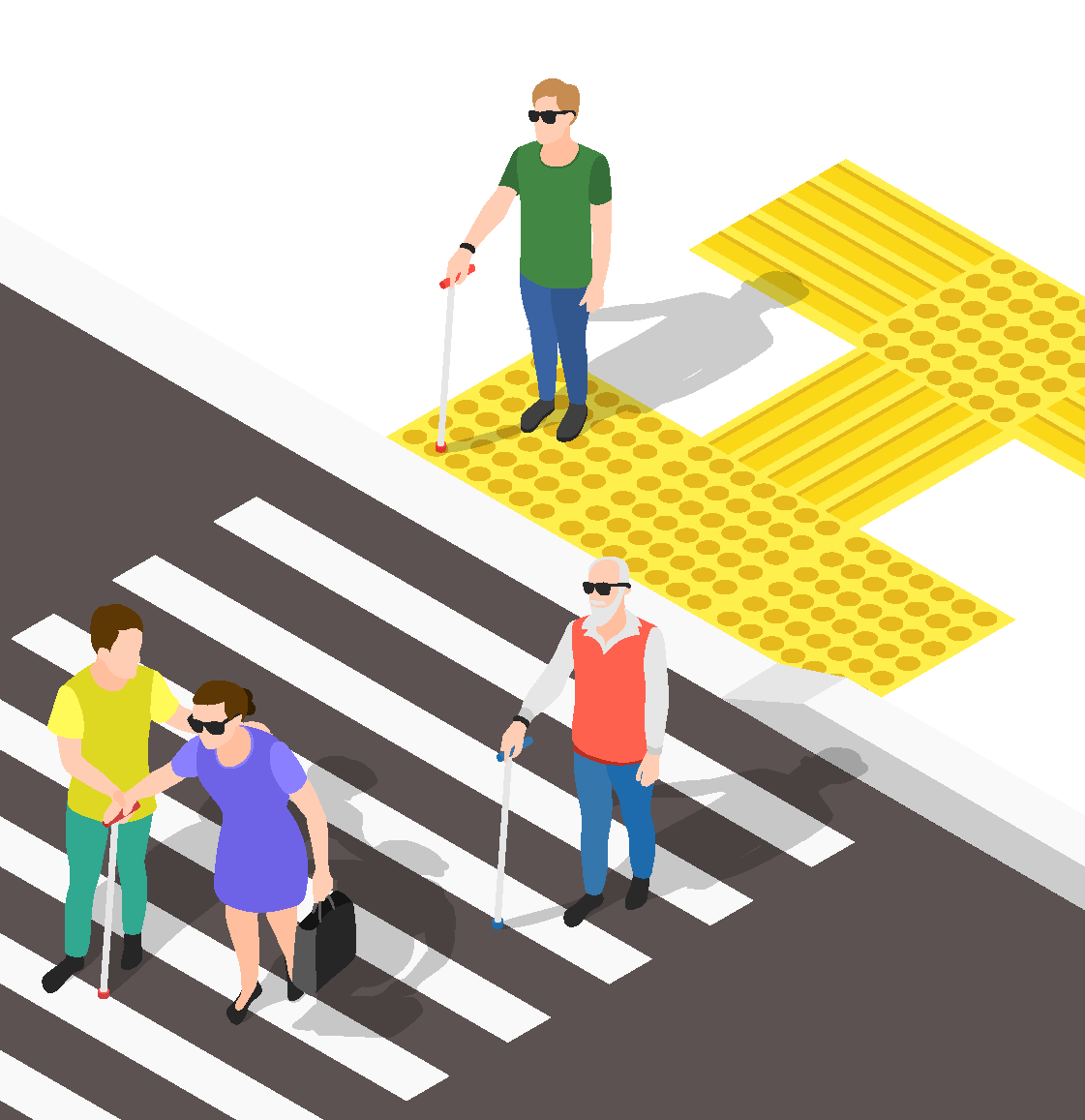
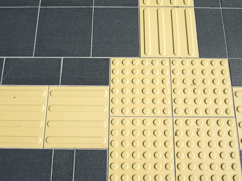
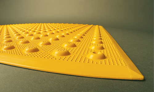
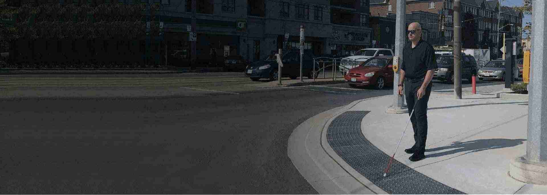
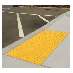
TWSIs, also known as detectable warning surfaces or tactile attention indicators, are standardized walking surfaces that provide information to those blind or visually impaired through texture and, in some cases, sound.
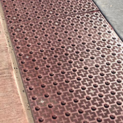
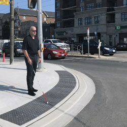
They are often created using inserts like metal, rubber, stone, or plastic or can be built directly into concrete ground surfaces. TWSIs should have a texture that is detectable with a long cane and can be felt underfoot. To reduce the possibility of tripping, their edges should be bevelled.
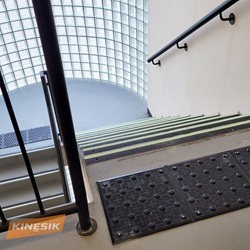
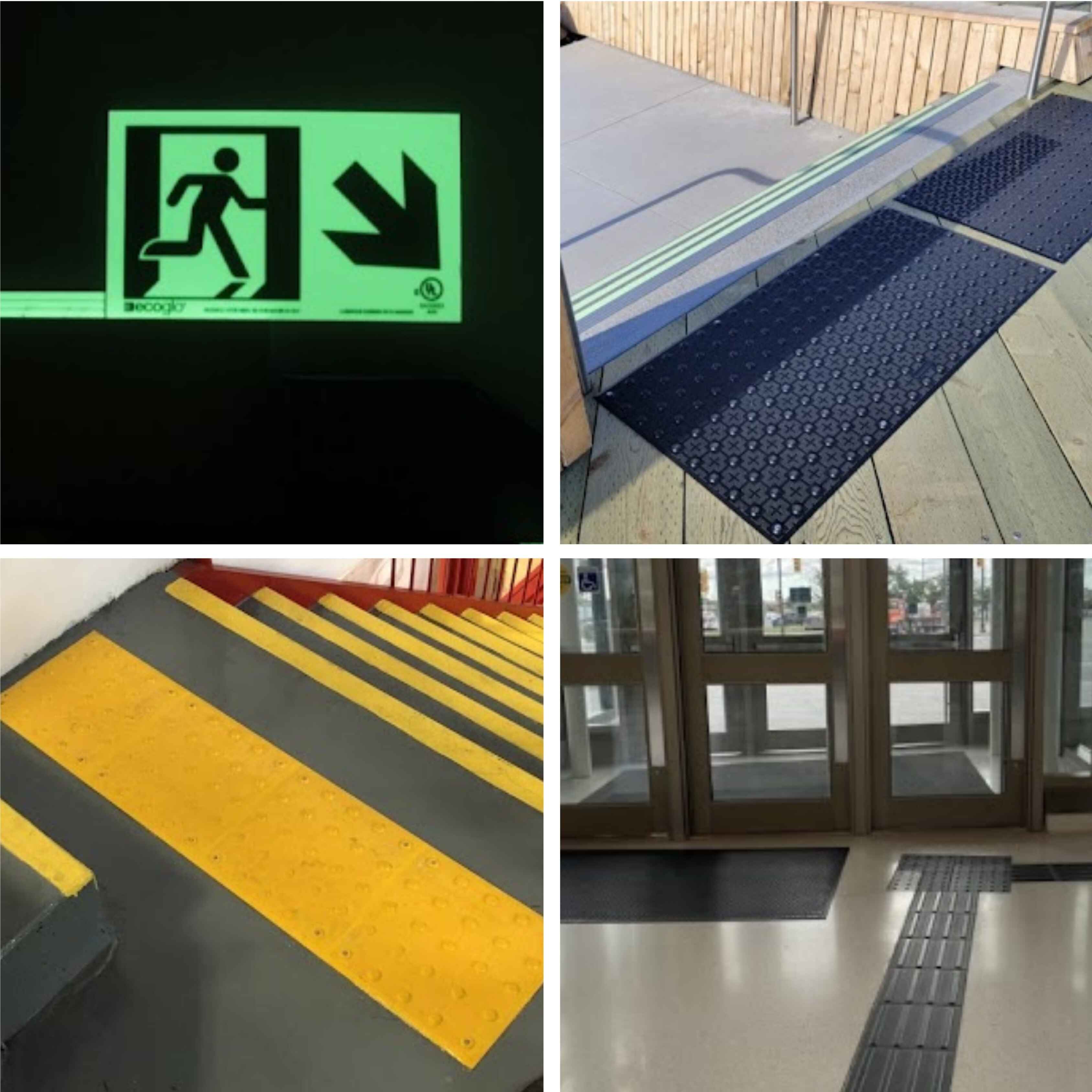
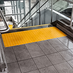
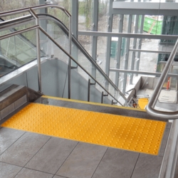
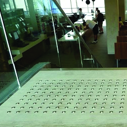
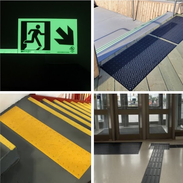
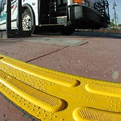
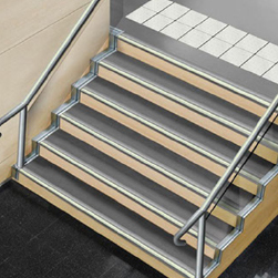
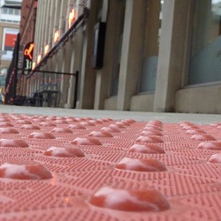
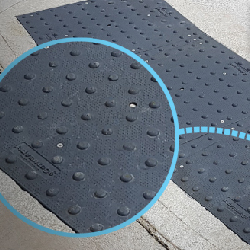
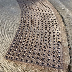
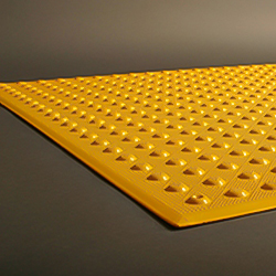
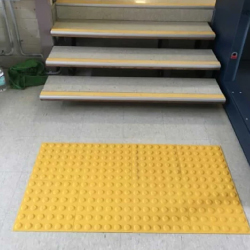
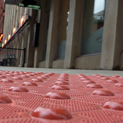
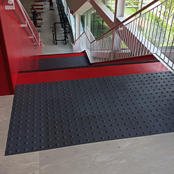
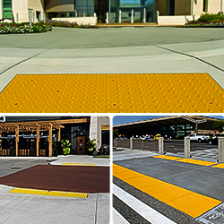
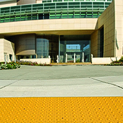
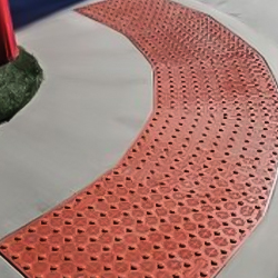
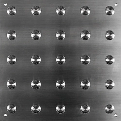
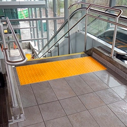
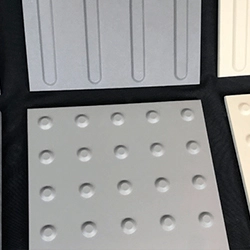
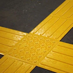
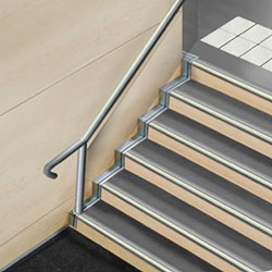
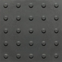
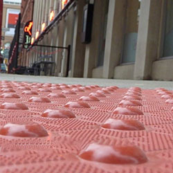
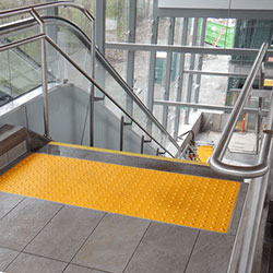
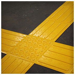
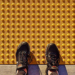
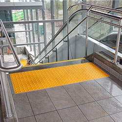
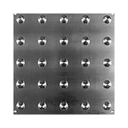
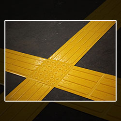
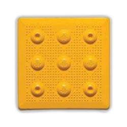
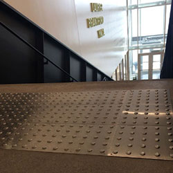
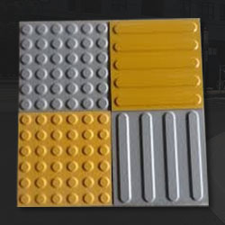
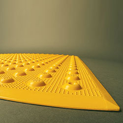
Sometimes referred to as warning TWSIs, TWSIs draw attention to critical hazards such as the staircase’s beginning or the platform’s edge. Attention TWSIs should be circular, flat-topped, truncated domes or cones on a walking surface.
Let’s understand the specifications of attention TWSIs -
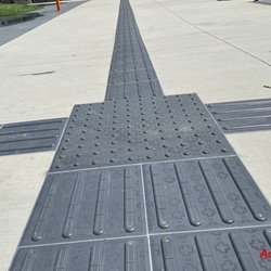
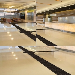
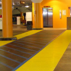
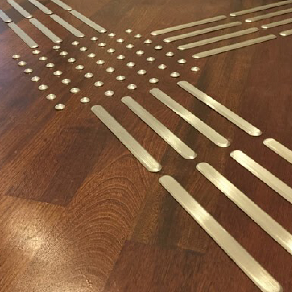
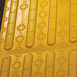
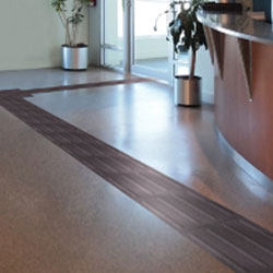
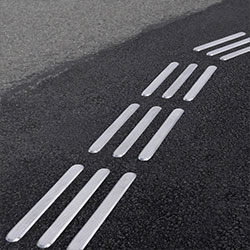
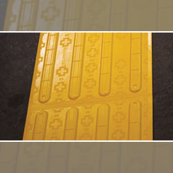
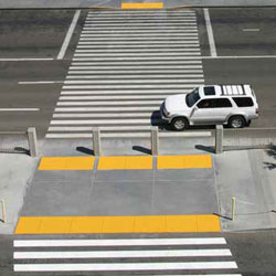
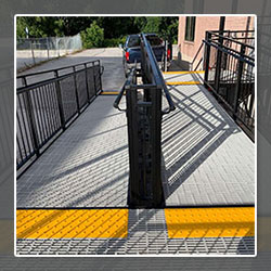
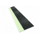
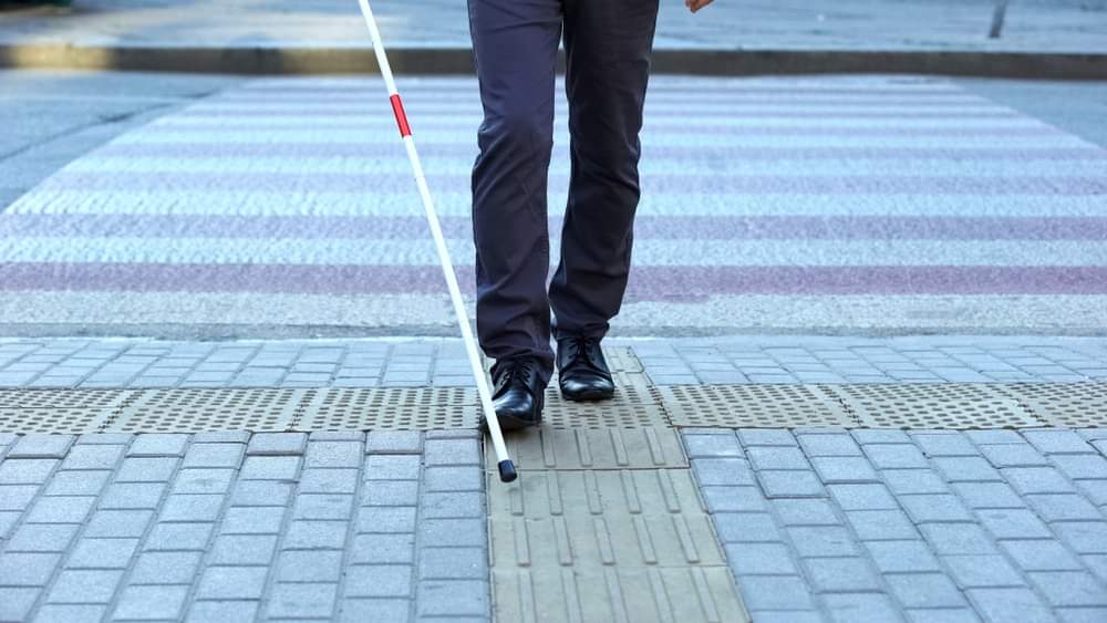
TWSIs for guidance should comprise a pattern of parallel, flat-topped, elongated bars extending in the direction of movement.
Let’s check out the specification for guidance TWSIs -
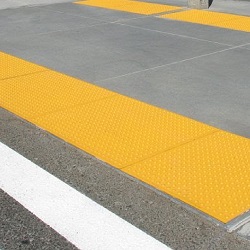
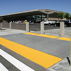
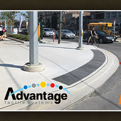
TWSIs used on road surfaces differ from guide surfaces in pedestrian zones. TWSIs placed on road surfaces at pedestrian crossings should -
The tactile solutions covered in this guide are obtained from multiple sources like National Building Code of Canada, CAN/CSA B651 Accessible design for the built environment, ISO/FDIS 21542 Building Construction – Accessibility & usability of the built environment and ISO 23599 – Assistive products for blind and vision-impaired persons.