For those with visual disabilities, high color contrast is indispensable for distinguishing important objects and navigational cues within environments. Insufficient tonal contrast between surfaces poses challenges. As Canada's leading tactile solutions provider, we examine how color contrast affects visually impaired users and why proper contrast should be prioritized in accessibility planning.
Roughly 1.5 million Canadians live with some degree of vision loss ranging from mild blurriness to total blindness. Visual impairment stems from diseases, age-related decline, or congenital conditions. It encompasses:
Low vision: Reduced vision that cannot be corrected fully with lenses or surgery. Acuity is 20/70 or worse.
Color blindness: Inability to distinguish certain colors. The most common is red-green color blindness.
Cataracts: Clouding over the eye's lens, causing blurriness and fading. Common in senior citizens.
Diabetic retinopathy: Damage to the retina's blood vessels triggered by diabetes, which induces blurriness.
Glaucoma: Peripheral vision loss when the optic nerve becomes damaged from fluid pressure buildup in the eye.
Macular degeneration: Gradual erosion of the central retinal area impairing detail perception. Highly age-related.
Even mild visual deficits create challenges in judging distance, seeing trip hazards, reading signage, avoiding obstacles, and more. Optimized environments empower users through inclusive design.
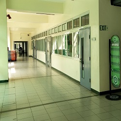
The sufficient color contrast between adjoining surfaces enables those with low vision to perceive edges and visual information better. Key advantages include:
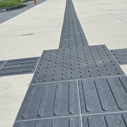
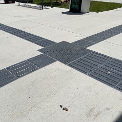
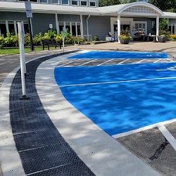
Distinguishing among distinct tactile and walking surfaces
Discerning elevation changes like curbs and stairs
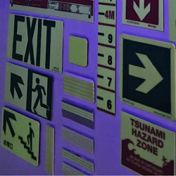
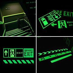
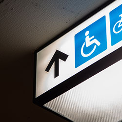
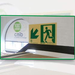
Identifying cautionary signage and safety warnings
Seeing doors, furnishings, amenities, and hazards in spaces
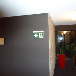
Reading lettering on signposts, displays, and control interfaces
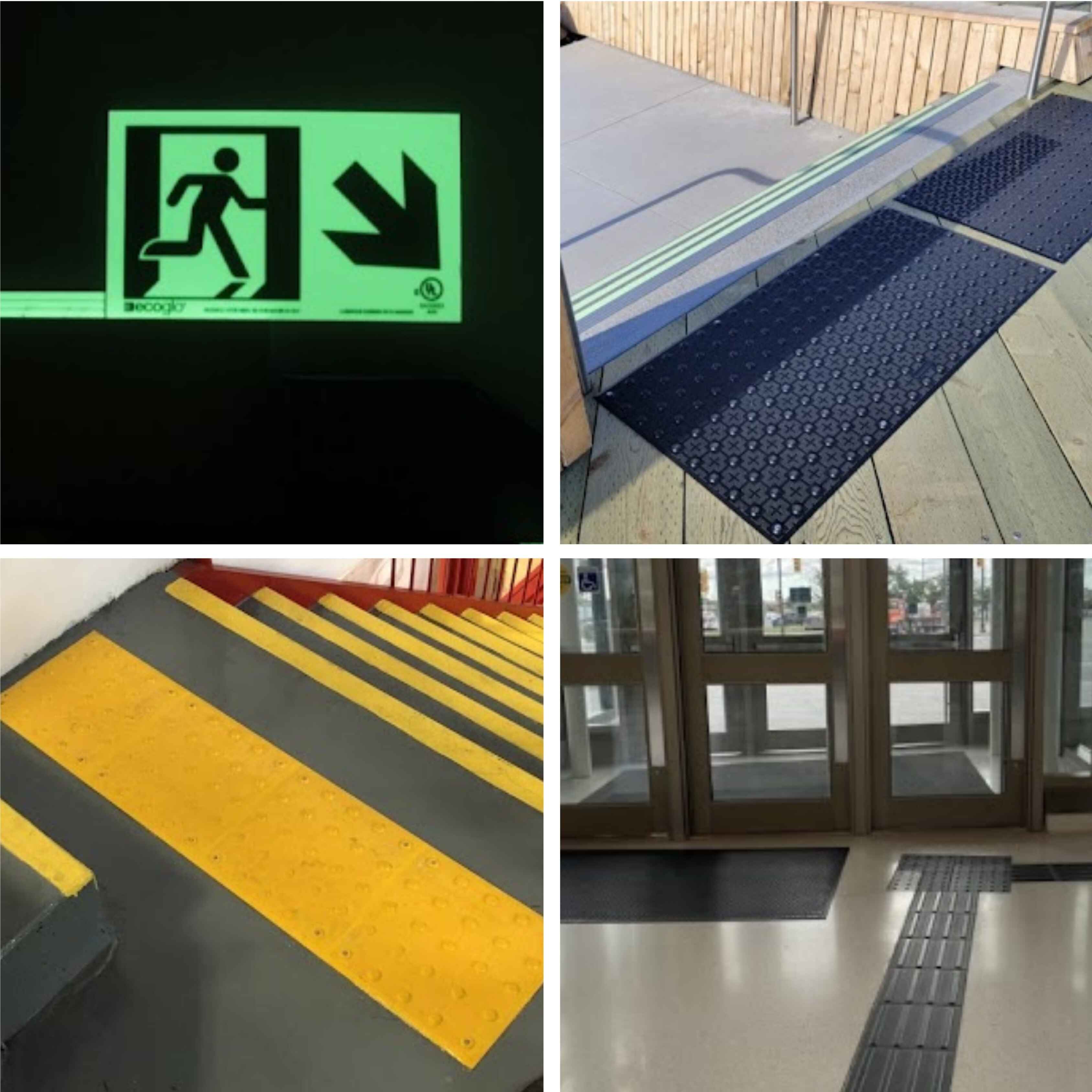
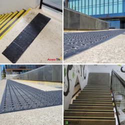
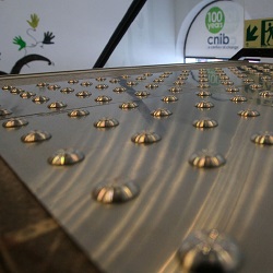
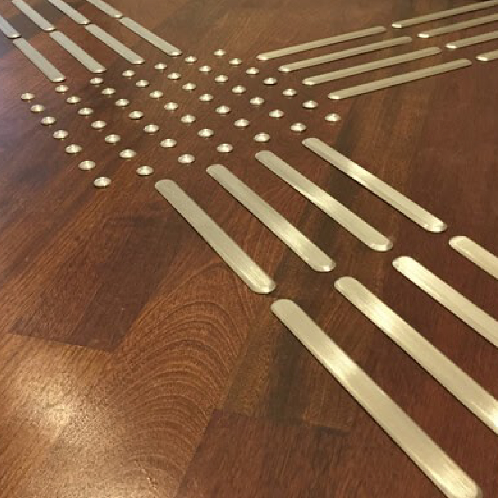
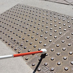
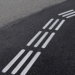
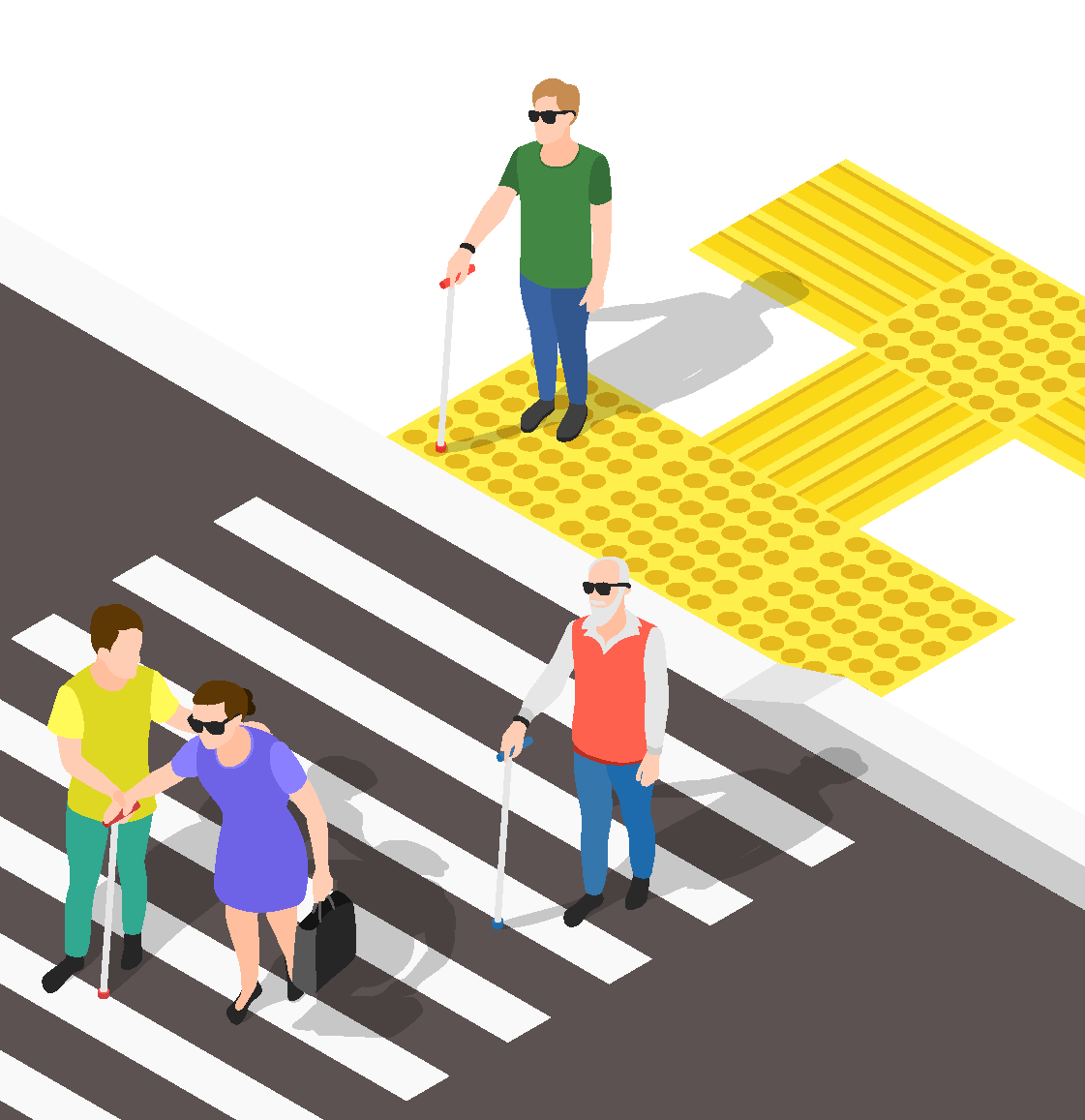
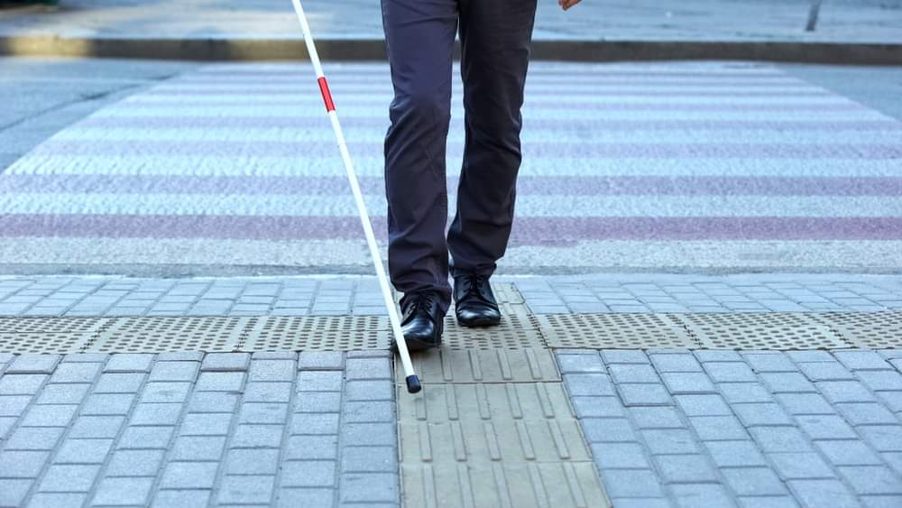
Detecting tactile wayfinding pads that guide navigation
Recognizing faces and expressions during social interactions
With thoughtful color contrast implemented across buildings and public spaces through accent colors, tonal juxtapositions, and highlighted elements, the built environment becomes more navigable for the vision impaired.
Standards like the CSA B651 mandate minimum color contrast levels for accessibility design elements to guide proper implementation. Some specifications include:
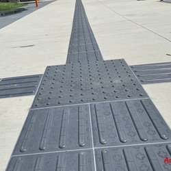
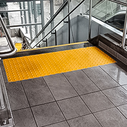
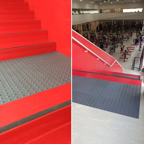
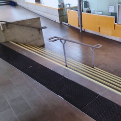
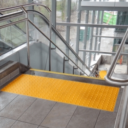
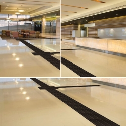
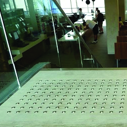
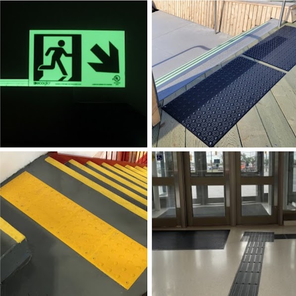
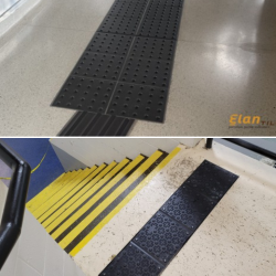
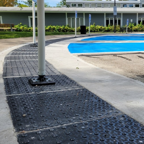
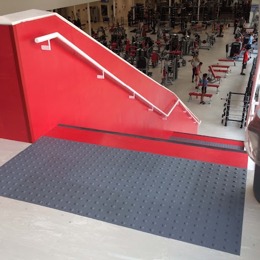
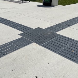
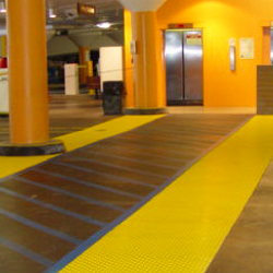
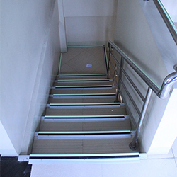
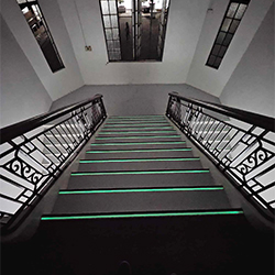
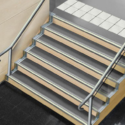
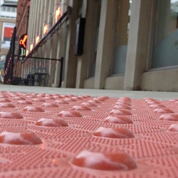
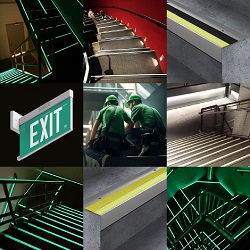
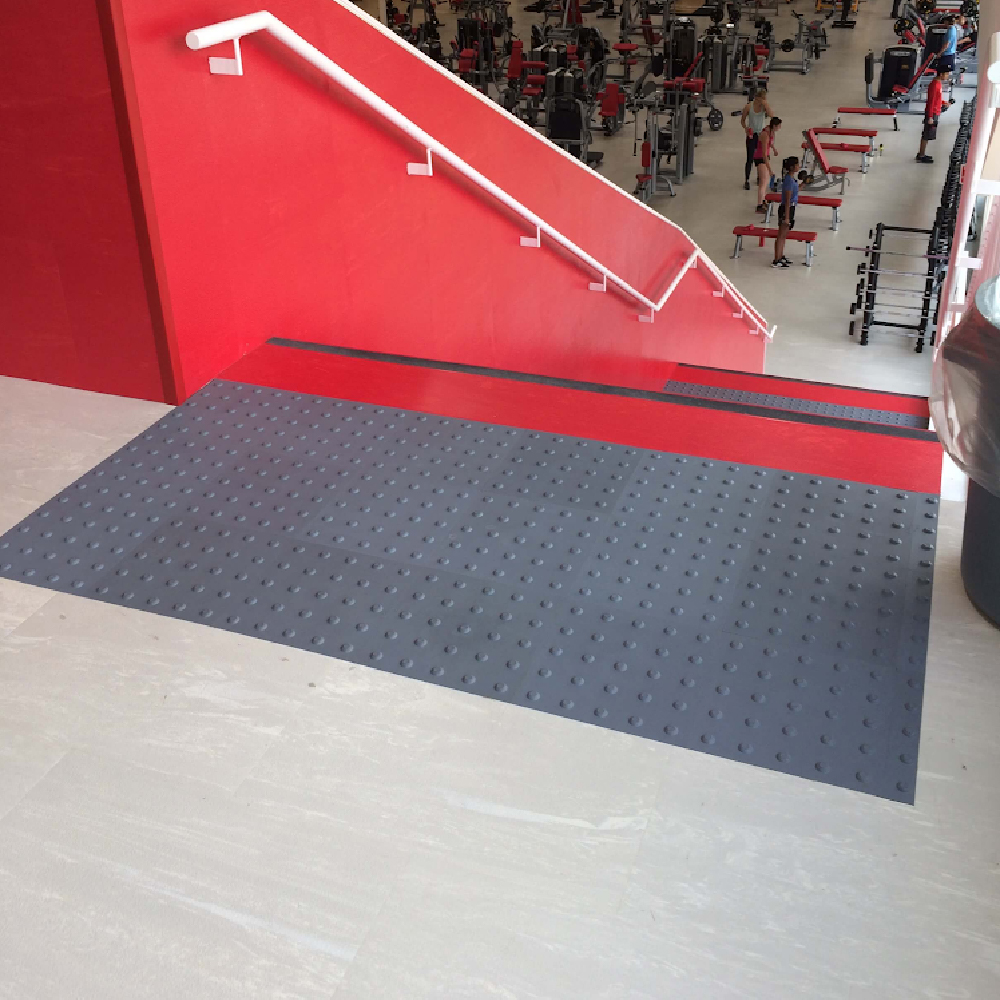
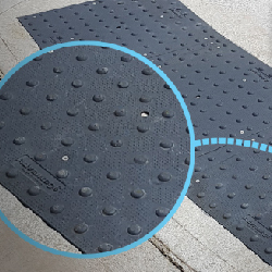
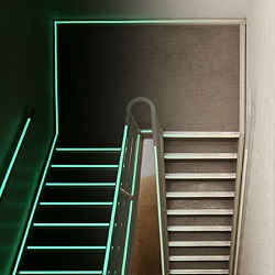
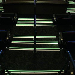
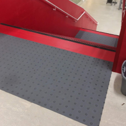
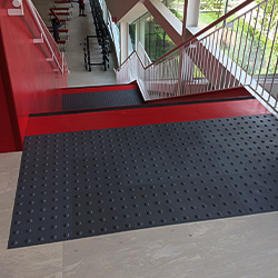
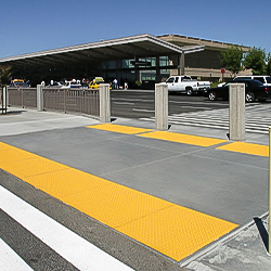
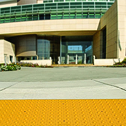
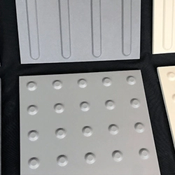
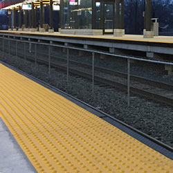
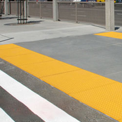
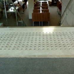
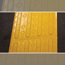
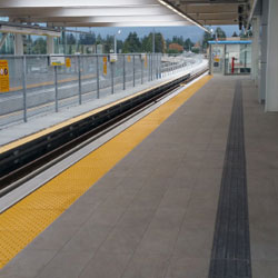
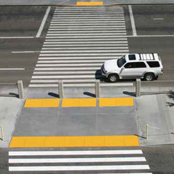
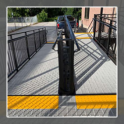
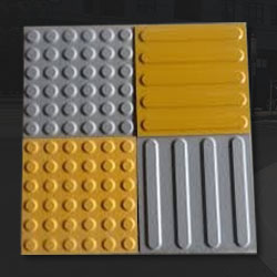
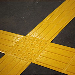
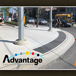
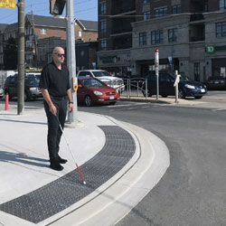
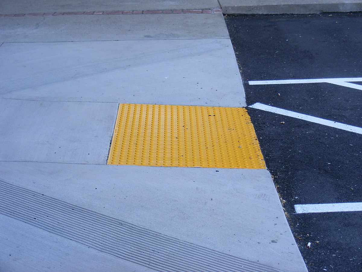
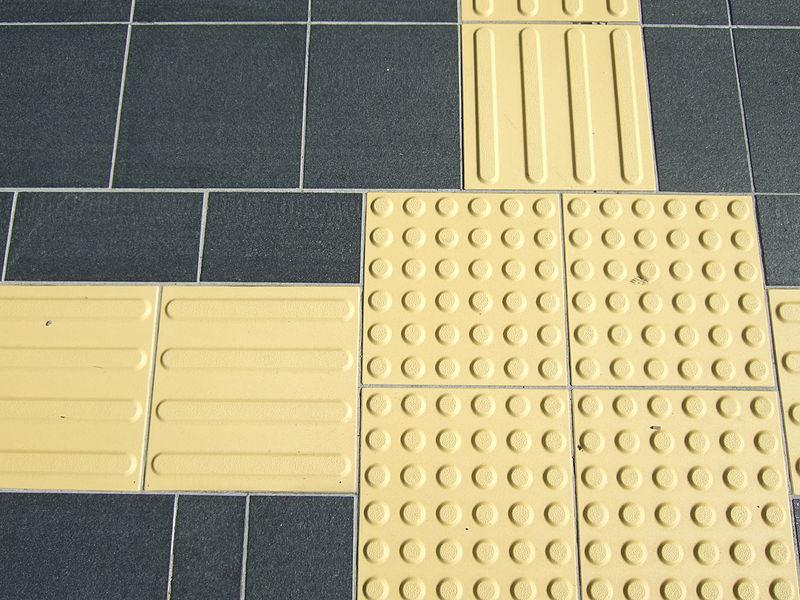
Tactile walking surfaces should contrast adjoining floors by at least 70% light reflectance value.
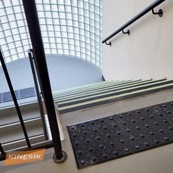
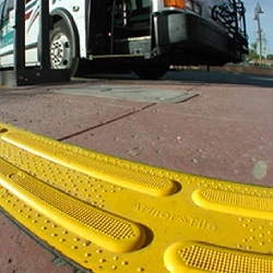
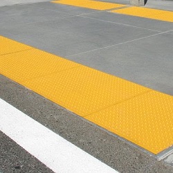
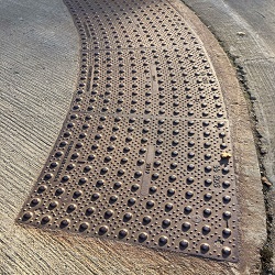
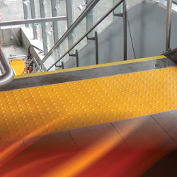
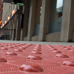
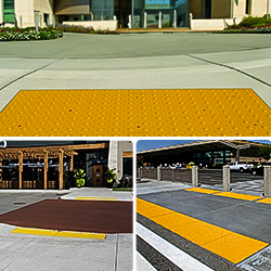
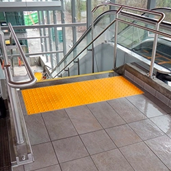
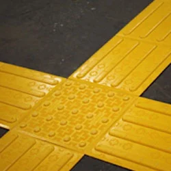
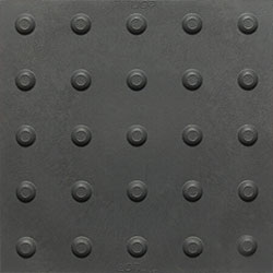
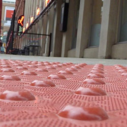
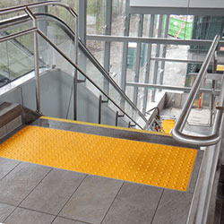
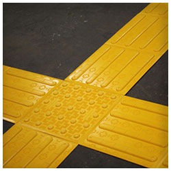
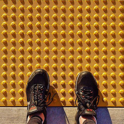
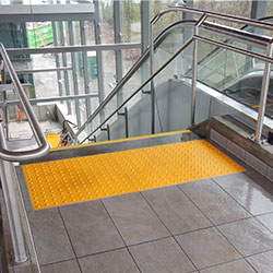
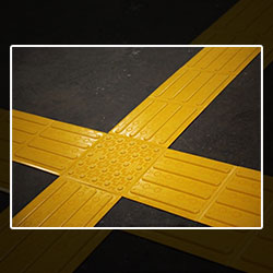
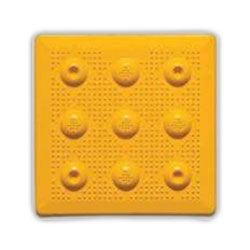
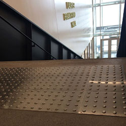
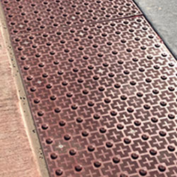
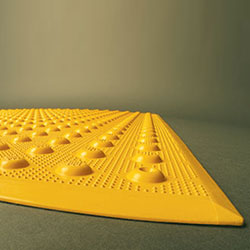
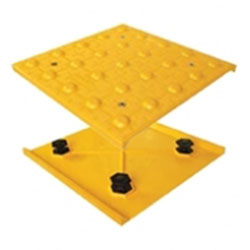
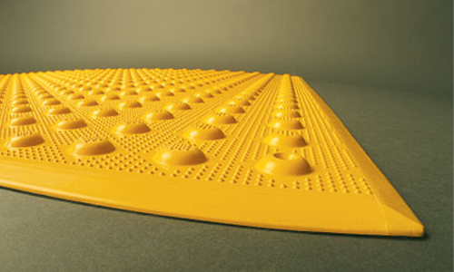
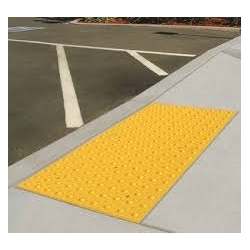
Warning indicators (e.g., truncated dome tiles) must contrast standard walking floors by at least 70%. Safety yellow against gray floors provides an ideal contrast.
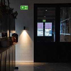
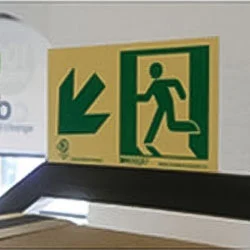
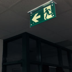
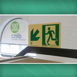
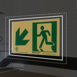
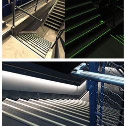
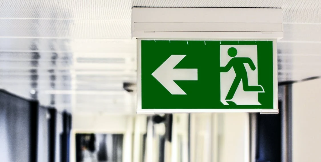
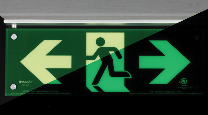
Text and Symbols should substantially differ from background colors. Light characters on dark backgrounds or vice versa.
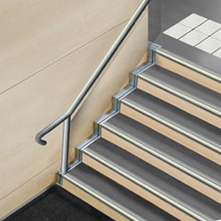
Handrails and Controls should contrast walls and furnishings through high-visibility colors.
Door Frames should exhibit at least 70% contrast from surrounding walls for visibility.
By consulting resources like the CSA B651 and incorporating sufficient color contrast in line with regulations, the built environment can be adapted to assist individuals with visual disabilities.
Several factors should guide color contrast implementations:
Aim for at least 60-70% relative luminance difference between adjacent surfaces and elements. Light tones on dark backgrounds or vice versa provide the best contrast.
Many visually impaired also have color blindness, especially red-green deficiency. Avoid problematic color pairings.
Prevent glossy or mirrored surfaces that create glare and reflections and obscure things like signage. Use matte paints and finishes.
Lighter wall colors and floors enable elements like railings or tactile pads to contrast strongly when darker.
Ensure consistently well-lit spaces with minimal shadows and no high-glare spotlights. Supplement with task lighting.
Highlight potential hazards using bold contrasting colors different from surrounding floors - like yellow or black.
Consult vision-impaired users on optimal color combinations that maximize perception based on their needs.
Periodically evaluate contrast sufficiency as lighting fixtures age, structural colors fade, or alterations are made.
Thoughtful contrast design guided both by standards and user input creates accessible, navigable spaces.
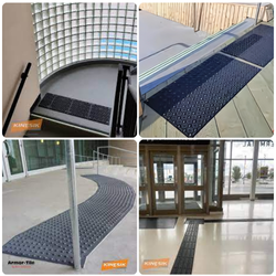
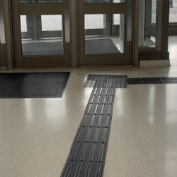
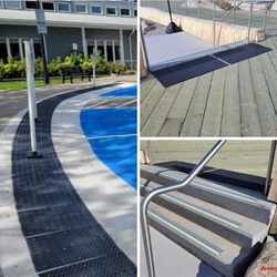
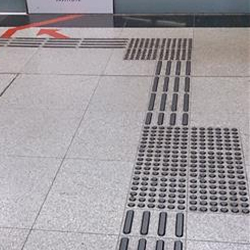
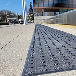
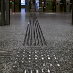
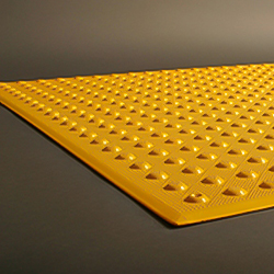
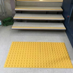
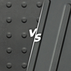
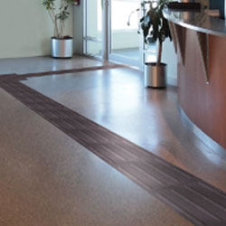
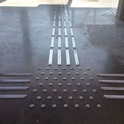
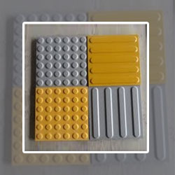
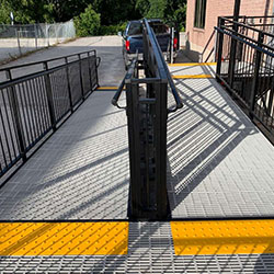
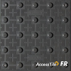
An important consideration with tactile walking surface indicators involves sufficient color contrast between tiles and adjoining flooring for optimal visibility. Our ADA-compliant tactile products leverage bold contrasting colors like:
Vibrant yellow truncated dome tiles against gray sidewalks
White wayfinding bars on dark charcoal floors
Safety yellow warning pavers embedded into concrete
Based on the setting, user feedback, and luminance testing, we advise combinations that meet 70% light reflectance value contrast levels per CSA B651. This enables those with some residual sight to detect vital ground surface cues better.
Accessibility regulations mandate certain color contrast minimums, but going further fosters inclusion. An accessible built environment through high visual contrast:
Allows independent mobility and avoids reliance on aids
Reduces disorientation and anxiety navigating spaces
Promotes confidence and dignity traversing independently
Welcomes diverse users and abilities into communities
Enhances experiences for all with clutter-free visual flows
Reflects universal design principles that are human-centric
The adage "contrast is king" rings especially true for those with visual impairment. The sufficiently high color contrast makes environments and interfaces more usable. By consulting leading standards and vision-impaired users, designers can strategically enhance tonal contrast in structures through surface colors, warning indicators, signage, and wayfinding. Contact our team at Tactile Solutions Canada for advice on maximizing accessibility and safety through compliant tactile products with strong visual contrast.
Here are some common queries about color contrast:
Using relative luminance or light reflectance values. Handheld meters and photometry software help assign numerical contrast.
Supplementary textural and tactile differences, audio cues, braille markings, and ample lighting can compensate somewhat.
Ideally, public facilities aim for at least 60% contrast between large adjoining surfaces. Brighter walls aid visibility.
Black against yellow, white text on dark backgrounds, navy blue contrasts orange well. Dark floors with light walls aid wayfinding.
Conduct user studies and surveys with vision-impaired participants. The test proposed contrasts under actual environmental conditions.